

Illustration: Step by step Waxwing
Science art, natural history illustration, natural science illustrations, botanical drawing; all these terms cover what I do, But this week’s blog is about creating an ornithological illustration, in this case of the Waxwing Bombycilla garrulus.
Drawing the Waxwing
First step is always to draw up the bird. I wanted to include background, and hoped scarlet and orange berries would echo the reddish areas in the bird’s plumage. I use a Pentel P205 mechanical pencil, and draw straight onto my hot press fabriano artistico watercolour paper.
Then I open my watercolour box, predominantly full of Winsor & Newton pans; and get out my trusty Winsor and Newton series 7 paintbrush (sizes 2 and 00).
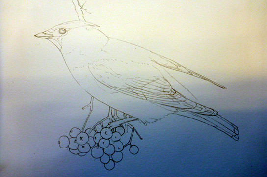
Pencil rough of the waxwing
I paint by building up a layer of hundreds of tiny little strokes, blending the colour by layering slightly different colours of paint. As you can see, the point on my brush is exquisite (that’s series 7 brushes for you) so there are no blunt lines or blobs of colour.
Mixing the waxwing pink colour
The pinkish hue of the waxwing head and body proved a real challenge to mix. I could see it had pinks and ochres in, and was slightly blueish. However, there was a solidity, a pastel-like thickness to the colour that I could only achieve by mixing in some white gouache. I normally avoid mixing with white as it makes the paint chalky and heavy, but in this case it achieved exactly the effect I was after.
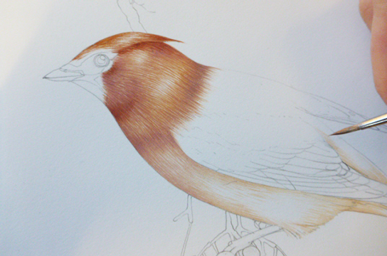
Paler areas are left white, so they can glow. I start plotting in the darks with some trepidation, and it’s always worth remembering it’s far easier to make watercolour darker than to lighten it.
I’ve added more yellow ochre to the head and body, which helps clarify the lights and darks, and adds a bit of richness to the plumage.
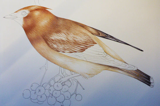
Painting the darker areas of the bird
Working closely from my photo reference (oh for a dead waxwing, or a waxwing skin to work from!) I plot in the crisp and dark feathers. I use endless tiny strokes to build colour and texture. All the brighter parts of the wing are left white. The red areas need be unified, so I will do them all at the same time, with the same paint colour.
It’s worth saying that I’m a stickler for blacks which feel properly dark and velvety. I don’t feel pre-mixed ones do this. Adding prussian blue or purple bulks up a black, and makes it a more interesting colour, too.
I tend to finish one area before starting on the next. I know many watercolourists work on the whole illustration at once, pulling the entire piece together by degrees. I favour a jig-saw approach. Bit by bit I add colour and detail.
Looking at details of the waxwing
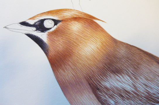
Above is a detail of the head of the bird. I include this so you can see how simple the whole process is. It really is just optical mixing of loads of tiny lines of colour. Getting gradations between colour works well using this technique, so I use precisely the same approach for the fur of mammals and colour on flowers.
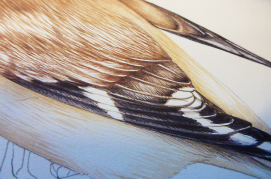
Similarly, on the wing you can see how the individual brush strokes try to echo the filaments of each feather, which helps give the bird texture. I try to draw as I apply the paint, and tweak the pencil sketch as I go.
Here the bird is nearly done. Areas still needing to be addressed include the legs, and the red areas. These are on the rump, head, mandible and wing. I left these until I’d finished the colour on the berries, the bird must echo these bright colours. It makes the viewer’s eyes travel across the whole picture, not just settle on the cluster of fruit.
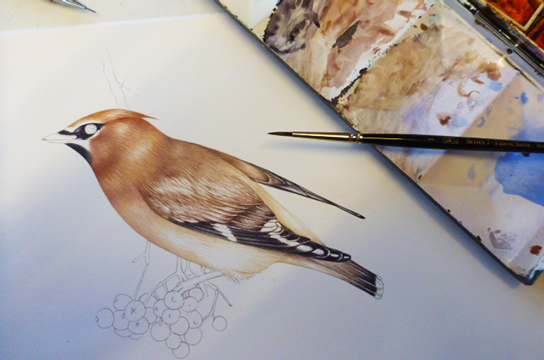
The story of a painting: look at the paintbox
A photo of my watercolour box shows how beaten-up and well-used it is. But also you can see how colour mixing happens in each area. On the far right there’s all the oranges to go on the feathers. These were mixed in the space used for the berries.
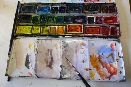
The middle areas are warm greys (the bird scapulars or shoulders) and darker greys which have been used to add definition to the edge of the wing and tail feathers. The mixing zone on the far left is bright yellows; these are the flashes of gold seen on the wing primaries.
I quite like the way a paintbox tells the story of what you last painted.
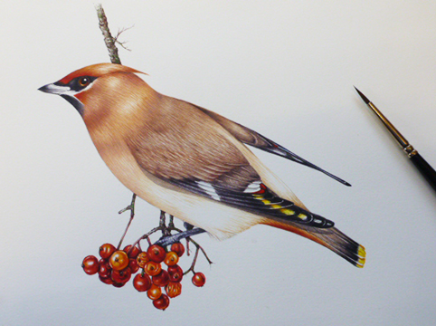
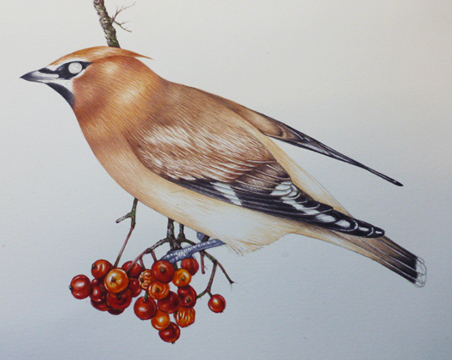
Finishing the Waxwing illustration
And below is the final piece.
Not only have the areas of red been added, but shadows have been put in. I was in two minds about the drop shadow below the wing; I’m glad I added it. It gives the picture a little more movement.
For some weird reason, the last thing I paint is always the eye. I suppose I don’t like being stared at as I paint! Although the eyes are always fun to do, I’m painfully aware that if I make a mistake the entire painting will be ruined. Painting the perfect curve of pure, solid black for the pupil, and leaving the plain white paper for the highlight is always terrifying.
I’m quite pleased with this one. It’s an amazing looking animal, sowas a treat to paint.
This lovely bit of film by Tommy Hyndman shows waxwings up close.