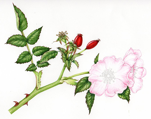
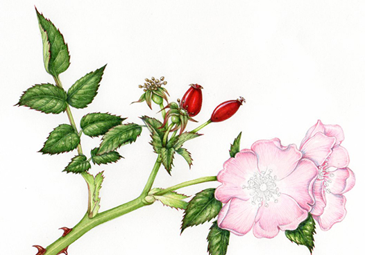
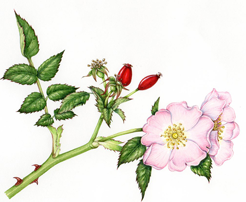
Dog rose: Step by step illustration
I’m currently working on a series of botanical illustrations and natural history drawings for Field Studies Council, who will use them on identification charts. One of the charts details edible British plants, and includes the Dog rose, Rosa canina.
The first step is to draw up a pencil rough. I use a mechanical pencil, such as the Pentel P205, and draw directly onto watercolour paper. I use Fabriano Artistico hot press paper, which has a high cotton content, and a very crisp and smooth working surface.
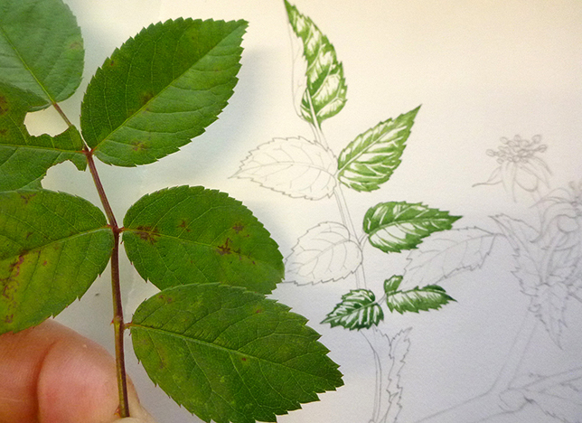
It’s always easiest to work from live specimens as you can examine them, turn them over, and put them under a magnifying glass. Although it’s autumn there are still dog rose hips and leaves to work from. (It’s worth noting that leaf colour is often compromised in autumn, as the chlorophyll is less in evidence, thus allowing the yellow and red pigments to be more dominant).
I also use books such as David Streeter’s Collins Flower Guide, the brilliant illustrations of Stella Ross-Craig, the Hedgerow Handbook by Adele Nozedar, and my own sketchbooks for reference. (See my blog on working without specimens for more on this).
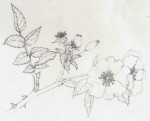
I email the rough to the client who will suggest alterations and changes where appropriate. In this case it was good to go without tweaking.
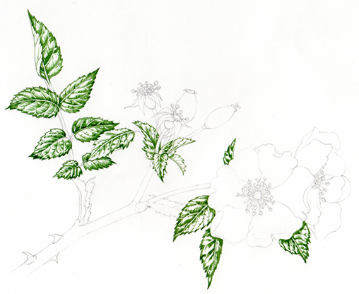
Painting the darkest areas of the leaves
First, I paint the leaves. Mixing greens is notoriously tricky, and you should never trust a green straight from the tube or pan; they simply don’t echo nature’s palette. I tend to favour Winsor & Newton watercolours , and always use a Winsor & Newton series 7 brush as no other brushes on the market hold their tips as well. Mostly, unless doing minute hairs on stems (a 000 size brush) or a big watercolour wash (a number 2 or 4) I use a number 1 brush.
The green of the dog rose leaves is based on a hooker green light, mixed with cadmium yellow light and some yellow ochre. It also has some blue in; to be honest I don’t keep a clinical eye on what colours I use; but will be sure there are some warmish purple-blues and some cooler green-blues on the go in my paint-box. I guess a spot of something like pthalo blue does the trick.
I block in the areas of shadow on the leaves, examining my specimen the whole time.
Next, I’ll soften these areas by lightening the green mix, adding a little water, and a little bit more yellow. I apply this wet mix over the area I’ve painted, ensuring that the lightest areas remain white.
Next, I mix up a yellower green which is used between the dark areas of the leaf and the lightest regions. With a little more water and perhaps more of a brownish yellow (indian yellow or yellow ochre) I also use this mix for the stems. I only paint one side of the stem, the one furthest from the light source (convention dictates this is the right hand side of the plant). Then using a watery version of the same mix I’ll fill in the rest of the stem, thus giving it some depth.
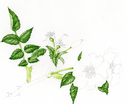
More work on the leaves follows, working into the darkest areas with a mix of hooker green, pthalo blue, and a purple. This sharpens the edges such as the dentate leaf margin, and gives extra depth to the shadows.
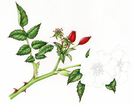
Illustrating the rose hip
After so much green, I can’t resist some scarlet – the rosehips. This vibrant colour is a mix of alizarin crimson, opera rose (more of which later), and cadmium orange light. Again, I plot the darks first, then a brighter area, and finally an oranger and paler third layer of paint. Again, leaving the white paper to show shine and highlights is vital.
Painting the Rose petals
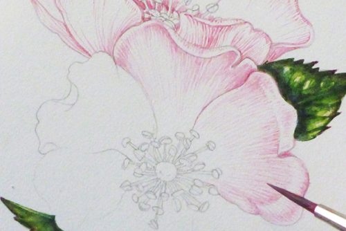
The petals are next. I’ve been driven mad in my attempts to get the colour of a dog rose right. It’s a cool pink, and in the past I’ve made the colour too orange, then too blue. My third error was to mix the pink in with white which gives the right hue, but a thick and utterly un-petal-like consistency and feel. Opera rose paint has been a life saver here. Watered down, mixed with the tiniest touch of cobalt blue, it provides a passable colour match. I build up the petals by painting on the veins and surrounding areas of colour with tiny repeated brush strokes.
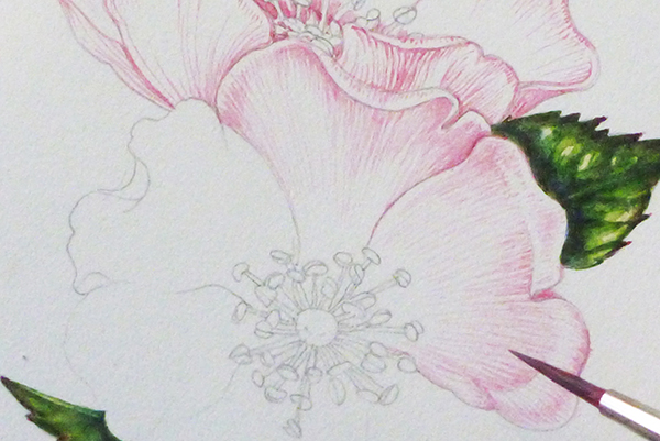
Although it’s important to keep the colour of such delicate petals pale, it’s also vital to give structure to the illustration. Getting this balance right is exhausting.
The petals cast shadows which need to be plotted; a good mix for these is a watery cobalt blue mixed with a purple or violet. As the shadows are plotted you can ensure that the two roses are clearly separated.
Adding the details
Last up is the anthers, stamens, and central reproductive organs of the flower. Brownish yellows ans pale greens play the main role here. A little more tweaking of shadows and crisping up the edges, this time with a violet and vandyke brown mix, and we’re done.
End of the day
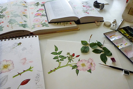
The last photo shows my desk at the end of the working day. There’s always room for improvement with a natural history illustration. There are always areas which haven’t worked as well as one might’ve hoped. However, as a decent depiction of a good rose, for someone looking to identify and eat it, I think this’ll do.