

Botanical Illustration: Step by step painting of leaves

I recently taught a workshop of botanical illustration of leaves. I broke down the process of painting a leaf into incremental steps. these were shown on a demonstration painting of a blackberry leaf.
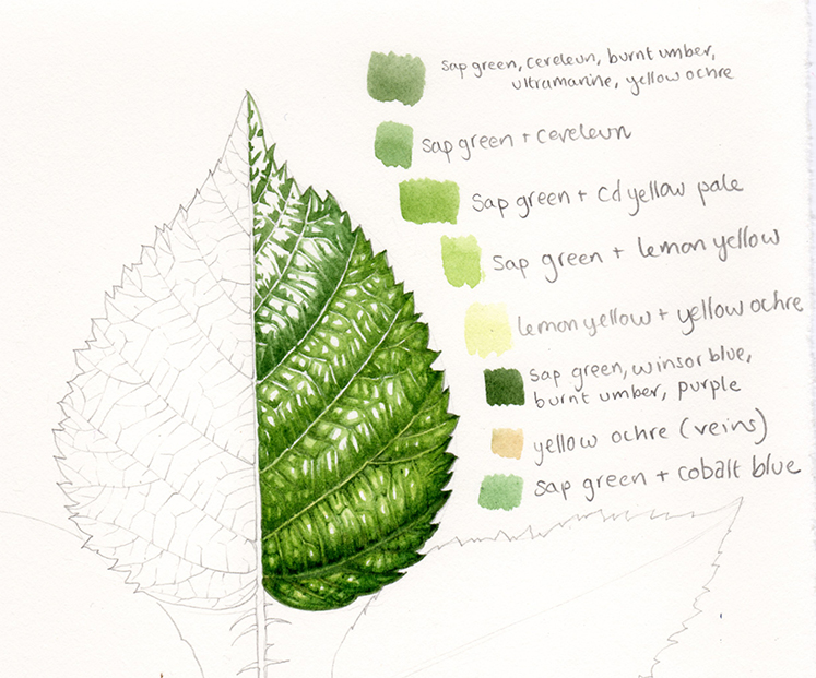
Demonstration illustration showing different steps involved in painting a blackberry leaf. There’s also a breakdown of the colours used to mix the greens that I used for each step.
I thought it might be worth deconstructing and explaining the processes in a blog. The illustrations below are magnified, and so are a little out of focus. My apologies.
Explanation of my process
It needs to be pointed out that the way I use watercolour to illustrate leaves is not true to the methods used by many botanical illustrators. There are various norms that I seem not to adhere to. For example, you’re never advised to mix more than three colours together for one mix. Most illustrators work from light to dark, not dark to light as I do. With these caveats in mind, I thought I’d still go ahead and show the processes I use. Just remember, they are a little renegade. I don not think my approach would gain universal approval or acceptance.
Draw the leaf properly
First step is to draw the leaf making certain that the shape, leaf margin, and position of the most visible side and lateral veins is correct. I do this in atonal pencil, mostly with an 0.5 or 0.3mm propelling HB pencil (such as the reliably good Pentel P205).
I draw directly onto hotpress watercolour paper, everyone has their favourite, I like Fabriano Artistico or Fabriano Classico best.
Mixing greens
I then closely examine the leaf and mix up a green that matches the leaf blade. (More on mixing greens can be found in my blog). I test the colour by applying a spot of it to the leaf itself. I plot in the shapes of the darkest shadows with my Winsor & Newton series 7 brush (choosing a number 1 or 0).
I use my trusty watercolour box. It’s a mix of Winsor and Newton and Daler Rowney pans. Colours that get used repeatedly in mixing of greens include: yellow ochre, cadmium yellow light and dark, cobalt blue, winsor blue, ultramarine, cereleun, vandyke brown, violet, sap green, hookers green, viridian, and chromium of oxide green.
I never use a ready-made green without mixing it with other colours. The colours straight from the pan are nothing like the greens found in nature.
Step 1: Paint in your darkest shadows

I use a mix of cereleun, burnt umber, yellow ochre, and sap green.
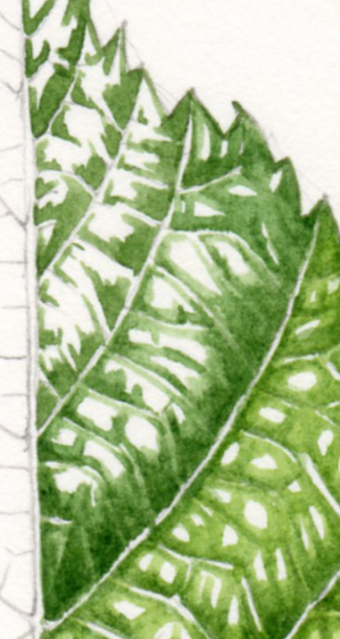
A more dilute version of the same colour is used to soften the edges of these blocks. You can see this on the lowest part of the leaf above. It’s vital to leave plenty of white, and not to swamp the paper with colour. With watercolour it’s always possible to make a colour darker, but almost impossible to lighten it. Trying to often makes the area look muddy.
Next, I mix up a mid-tone green and apply this to the flat areas of the leaf. These are areas which are not caught in the bright highlights nor swallowed by the darker shadowed parts. For this blackberry leaf, this was a mix of sap green and cadmium yellow pale.
Again, it’s vital to leave the white of the page.
Step two: Working into the midtones with a lighter and yellower green
I tend to leave the veins white. They are often yellower and paler than the leaf blade. If not, they may be a very different colour such as crimson or purple.
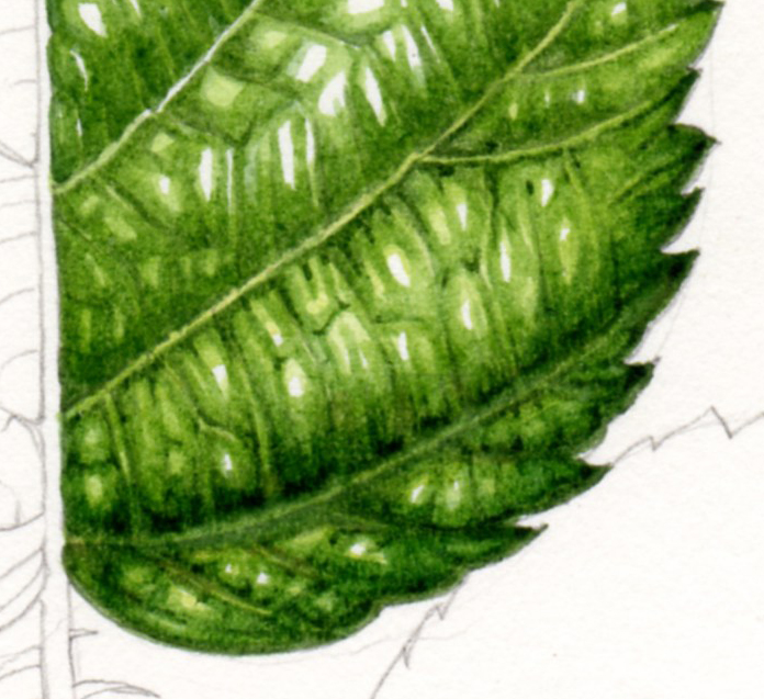
Next is a third mix, far paler and more dilute than the others. This knocks the stark edges off the white highlighted regions of the leaf. In this example I also apply this wash to the veins which are a yellowish green colour. The mix is composed of a lot of water and sap green with lemon yellow.
I also cover some of the remaining areas of white with this pale shade. This helps the palest regions of the leaf stand out. It also adds some shape to the leaf. The areas closet to the veins tend to receive this treatment as they are often marginally darker than the central highlights between lateral veins.
Next, I’ll mix up quite a thick dark colour and pick out the deepest areas of shade with the tip of my paintbrush. This mix often features browns, purples, and blue. It needs to be added very carefully to avoid swamping the greens. For this bramble leaf it was a mix of sap green, burnt umber, winsor blue, and purple.
Step three and four: Applying a very pale yellow-green wash, and working into the darkest shadows.
The final step is to put a very very dilute and pale overwash across the entire painting. You can see this in the lowest area of the blackberry leaf. Frequently this will be yellow ochre with lots of water. In this case it was yellow ochre, lemon yellow and plenty of water,.
This last wash tends to help unify the gradations and colours of the leaf. Yet it is pale and light enough not to compromise the white of the paper which still remains. This paper shows the highlights on the leaf blade.
The left hand side of the leaf below shows the whole process in play; it was done as a demonstration for students so is far from perfect. However, it shows how the steps described look on a larger segment of a leaf. This is the same piece, but for some reason this scan is brighter and yellower than the others.
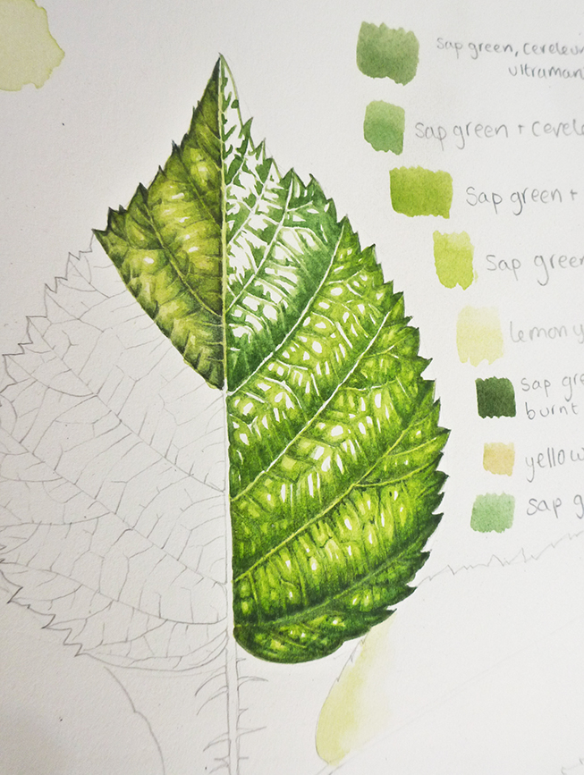
Blackberry leaf with breakdown of steps on the right, and a segment fully painted on the left.
Showing this approach in context
This page of studies of the Hazel shows a graphite study of the lights and darks on a hazel leaf, and a leaf painted according to the methods described above
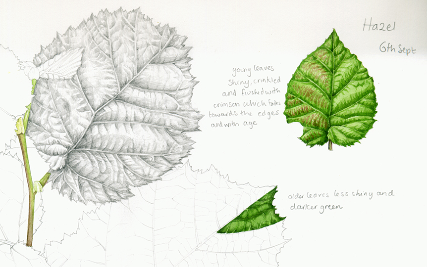
Sketchbook study of the Hazel Coryllus avellana
Leaves with less stark areas of light and dark
Not all leaves have such sharp distinctions between areas of light and dark, and in these cases a more gradual and smoother gradient of shadow is required. The processes used, however, remain true to the steps explained above. There’s just a gentler approach to the edges of areas of colour (as shown in this study of a Dandelion leaf).
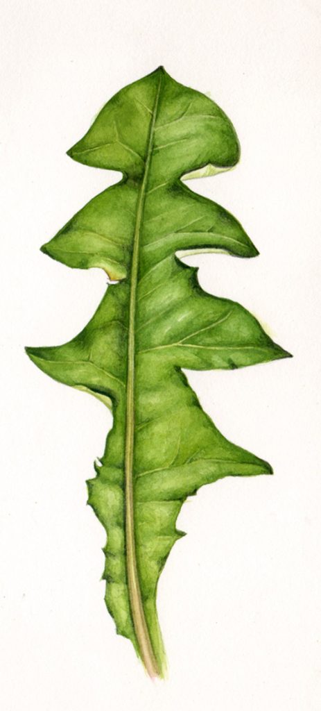
Dandelion Taraxicum officinale leaf showing smoother transition between areas of light and dark on the leaf blade.
Using this technique with all my botanical illustrations
Whether the illustration is for a sketchbook study where I’m gathering reference, simply painting for the joy of it; or whether it’s for a commission for a client, the plotting in of darks, tackling midtones, tweaking the darkest shadows and then unifying the entire leaf with a pale overwash remain a constant. They’re pretty evident in this finished illustration of the Hazel done for a Field Studies Council identification chart.
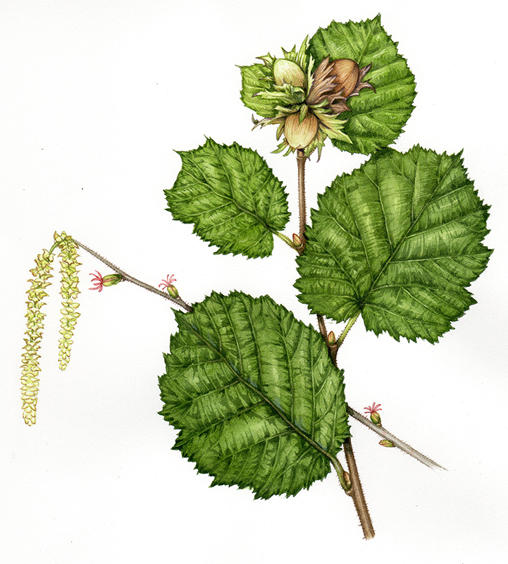
Hazel illustration
As I mentioned, this approach to botanical illustration seems rather different from many traditional approaches, and I wouldn’t for one moment reccomend it above techniques which have been tried and tested for centuries. I just wanted to present a detailed deconstruction of the processes I use to illustrate the beautiful and gloriously diverse leaves which are all around us, in the hope that they may be of use to someone out there, somewhere…
Thank you for sharing your talent and knowledge! Being an absolute beginner it’s very useful!
Anytime. I still find step by steps by other illustrators really helpful, and everyone has a different approach so it makes for interesting reading too! So glad my blogs are useful to you, and thanks for taking the time to leave a comment.
So interesting, your blogs are so incredibly insightful. I have emailed you Lizzie!
Hi Amanda, Thanks for such positive feedback. I’ve got your email, fascinating and inspiring! I’ll find a moment to give it the time and respect it deserves, In the meantime, Im so glad my blogs prove useful, that’s wonderful.
Very well presented. I’m a beginner and your steps were so clear to understand. Thank you
Thanks so much for taking the time to leave a comment, and I am so glad it’s an easy to understand blog. It can be hard to explain visual things using words, so it’s lovely to get your positive feedback. Good luck with your painting and illustrating!
I love it. Thank you
Hi Alyssa
So glad to be able to help! And thank you for leaving a comment.
XLizzie
Thanks for sharing your method, Lizzie. Your watercolours are beautiful. It’s very interesting to see the effect of going from dark to light values (I’ve always gone the other way). I’m definitely going to try it and see how it goes for my painting.
Hi Rosalie
I know, I do rather work back to front. No idea why. Do give it a whirl, you might enjoy it. Although for me working from light to dark would be so tricky, so flipping the process might be a challenge. Be interesting to know.
Thanks for sharing, Lizzie. A lot of time goes into a realistic leaf, and I’m yet to get it down but persevering. Good to have your approach to consider as well. Marking out the darks makes sense as it preserves your pencil markings, which get lost very quickly in the washes. Planning to try this on a hydrangea I’m painting.
Stay safe!
Hi Syndy
Yes, with the pencil marks getting swallowed up, it’s true. And actually you can often erase some to a greater or lesser extent once the painting is done too. I agree with the importance of getting as many different approaches as possible going on, means there’ll be an approach fr most situations. Bet your hydrangea painting will be gorgeous. Yours, Lizzie
Lizzy this is my first time on pintrest properly. I was unaware of the wonderful tutorials that can be viewed. Thank you so much for sharing.You have inspired me and calmed my rush to do everything at once and take time to prepare. What a gift you have. June
Hi June
What a fabulous comment! Yes, I know, when you first start doing something the euphoria makes you want to take on the whole world in a rush! It can be quite a discipline to, as you say, slow down and untangle specific goals. I’m so glad you found this useful! And thankyou for your kind comments
Dear Lizzie, Thank you for your generosity in sharing your knowledge and talent. I am very new to a variety of drawing and painting efforts I cluding the Zentangle method. But, am very drawn to color. So I relay appreciate your willingness to share your gifts so freely. Thank you!
Hi Christine
I truly think that doing what I do should be accessible to everyone – it’s so easy to find a leaf to paint, sometimes people just need their confidence boosting to make a start. If I get one person to think they’ll give it a go who might not have done so otherwise…then I’m one happy lady. I’m going to look at the Zetangle method, Ive not heard about it before. And for someone drawn to colour, well, botanical illustration is a great place to dabble and mix and experiment. Thanks for the comment, and good luck with your endeavours!
Yours
Lizzie
Thank you for the clear steps and explanation of your process. It is rare to find an artist who is also good at breaking down the parts of the process in such a straight forward manner. Now to master the techniques you explained so well!
Hiya Dennell
Oh, I’m so glad you think I’m clear. I do worry sometimes. Illustrating ends up coming as second nature, so you have to deconstruct in order to know what you’re doing, and I worry things might get left out because I don’t do my analysis right. Good to hear you think it’s coherent! And as to mastering those techniques? All just a matter of putting in the hours (or finding time to practice). Enjoy!
X Lizzie
Hi Lizzie
Thanks a lot for this tutorial. I’ll try it immediately. Your steps are well explained.
Irene
Hi Irene
So glad to be of help!
Lizzie
I tend to work in acrylics and oils. My foray into watercolor was unsatisfactory(read didn’t turn out well lol) Seeing your illustrations and steps makes me want to try, try again. Your work is beautiful and I enjoyed this blog very much.
Hi Carole
Ah, well you should know that you’re braver than I am – I’ve never even tried oils! Can you imagine the horror and chaos if I did! Acrylics I dabble with, mostly painting things like egg cups, stones, hairbrushes for presents. But yes, its totally different, and you have to switch so many things about in your brain that it’s exhausting! But that’s wonderful that you’re minded to give watercolours another try. I’m so glad to hear it. Thanks for leaving a comment, and good luck with your new foray into the watery side of painting.
Hi Lizzie,
I live in Georgia, USA. For many years, I have collected and tried to paint fall leaves…with miserable results! Though this tutorial is on green leaves, your explanation of the paint application process was very helpful.
Will search your tutorials for one on painting fall leaves. Thank you for sharing your knowledge.
Judi
Hi Judi
Actually, if you’re ok with painting green leaves, the fall leaves are going to make you really happy as they’re quite a lot more fun! Here’s are a couple of links to youtube videos Ive done on painting autumn leaves, with the associated blogs:
The first one is on Boston Ivy, lots of reds and yellows
https://youtu.be/0UAvyOgkGb0
https://lizzieharper.co.uk/2018/11/botanical-illustration-of-an-autumn-leaf/
The second is of a sycamore leaf, all yellows and greens:
https://youtu.be/PEdQLevbBHE
https://lizzieharper.co.uk/2020/12/botanical-illustration-of-a-sycamore-leaf/
Hope this helps, and good luck with your autumn colours!
Hi Lizzie, I’ve been following your blogs and video tutorials for a while now and although I haven’t done any painting for so many years I find your method just seems to make more sense and the finished result looks much more natural, I’m using your method for all my botanicals…and so far have been happy with my efforts ..still a way to go yet though !!
This has come later in life for me and finding it so relaxing.
Thank you for sharing your knowledge.
Sandra [ex pom in Australia]
Hi Sandra
What a wonderful comment, I’m so pleased the way I work is helpful. I’m just not clever enough to hold all that visual info in my head when it comes to traditional botanical illustration. You have to go from light to dark, so there’s no guidance, which I find really difficult. Glad it works for you, and that you;re enjoying creating your art, what a lovely thing to hear.
I agree.. it makes so much more sense to me. I tried following some other botanical artists because it was always something I wanted to do and I was so lost. By the time they start getting to the mid tones let alone the darks everything was just a mass of color, and all the guidelines are basically invisible. Probably didn’t help I was coming from decades of acrylics where dark to light is the norm.. this process speaks my painting language I guess.
Yeah, I agree. It’s the way other botanical illustrators can hold all that info in their minds that amazes me, no guide lines. I need not only all the anatomical info, but also light pencil demarcations showing where my highlights are. Im glad this approach works for you. It’s unconventional, I know, but for quite a few folks it seems to make more sense, and be easier to master. Well done for trying watercolour when youre used to acrylic, that’s so brave. x
Lizzie, thank you. Your work is breathtaking! And you share your process so clearly. I had no idea such detail and precision were possible. And the colors! I aspire.
Dear Phyllis, thanks for such a kind comment! And I’m glad I make the process seem straight forward. When you unpick these things, it often isn’t nearly as impossible or mysterious as it might appear at first! Thanks again, Lizzie
I have only been painting in watercolor for a year. I use to paint in oils for 11 years but I have always found the delicacy of florals in watercolor beautiful. Plus a find cleaning up from watercolor vs. Oils is a lot easier. I am a spong soaking up everything I read and watch. I wish to thank you for taking the time in this step by step tutorial as well as providing the colors that you used. I’ve never used the ink like watercolor and find that interesting. I am so happy to have found your YouTube Channel. I have watched other botanical illustrators, because each illustrator has many things to teach. Once again. Thank you! I appreciate the time it took you.
Hi Delores
Thankyou! You are brave, switching mediums like that. Id be terrified if anyone asked me to paint in oils! And how wise, to gather hints and tips and techniques for the wonderful resource that is Youtube. I’ve learnt loads from other people’s videos, too. And thanks for noticing the time it takes to make the film. the painting is the easy bit, it’s the editing that takes ages! Enjoy your journey into watercolour painting, but you’ll excel with all your prior experience and open minded attitude.
X
Hi, I really enjoyed reading your blog. I learned a lot and thanks for sharing your expertise with us.