

Step by step Great Willowherb

One of the botanical illustrations I was recently commissioned to complete for the Field Studies Council is the Great willowherb, Epilobium hirstutum. This will feature in an upcoming leaflet on Wayside wild flowers.
Here is an explanation of the steps involved in creating a botanically accurate illustration which is also visually appealing. It needs to allow a novice to identify that flower in the field. The approach is similar to my other step by step botanical illustrations. The species and colours change, but my approach remains more or less consistent!
Getting reference
First, I gather my reference. The illustration rough was done in January, so no Willowherbs were around. This means I rely on stalwart books like Collins Guide to Wild Flowers of Britain by David Streeter and Wildflowers of the Bristish Isles by Garrard and Streeter. For accurate anatomical information I use my volumes of line drawings by Stella Ross-Craig. These are a must have for any botanical illustrator working with the British flora.
I use a mechanical pencil (I love the Pentel P205) and draw direct onto hot press watercolour paper. In this case I worked on Botanical Ultra Smooth HP produced by St Cuthberts Mill as my trusty Fabriano paper has changed and is no longer good for botanical work (here’s a link to a recent blog on this topic, it’s quite an issue in the botanical illustration community!)
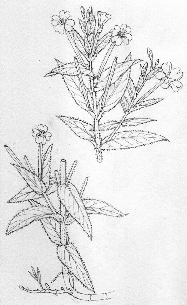
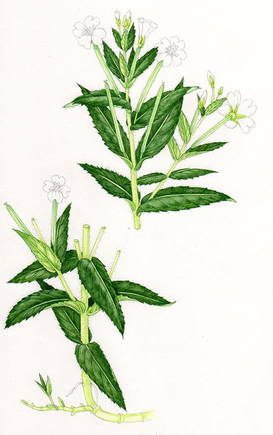
Pencil rough of the Greater willow herb
The pencil rough needs to be clear, and to include all the traits that clearly identify this plant as Epilobium hirstutum rather than any of the other Willowherbs. As the name suggests, these include an all over hairiness. Traits also include information on how it grows with basal side shoots, leaf shape, and presentation of the flowers and seed pods. A cut stem shows height, this is a tall plant.
Once I get the go-ahead from the client, I can start “colouring-in”. She and three other botanists pore over my roughs to make sure they’re are no inadvertant errors.
Adding watercolour to the leaves: Structure and darks
I use Winsor and Newton watercolour pans (which I top up with watercolour tube paints, I know you’re not supposed to mix pan and tube, but it works for me!) The best brush in the businesss is a Winsor and Newton series 7 sable brush (size 1 and size 000); I love them.
I always start out by plotting in the darkest areas of the leaves. These show form, and explain to the viewer the shape of the leaf as it’s described by the light falling on it. In this case, I used a mix of Hooker green dark, Cadmium yellow (pale hue), Yellow ochre, Cobalt blue, and Winsor blue. I sometimes test to be sure my green is mixed right by applying a tiny spot of the paint to a leaf of the plant I’m painting. Obvisouly, when I don’t have the actual plant itself to hand I can’t check my mixing this way.
The leaves cling to the stem (they’re amplexicaul, curling around and up the stem they arise from). Using shadow helps underline this feature.
The underside of the leaves are a paler green. I only plot in one line to suggest where each vein casts a shadow.
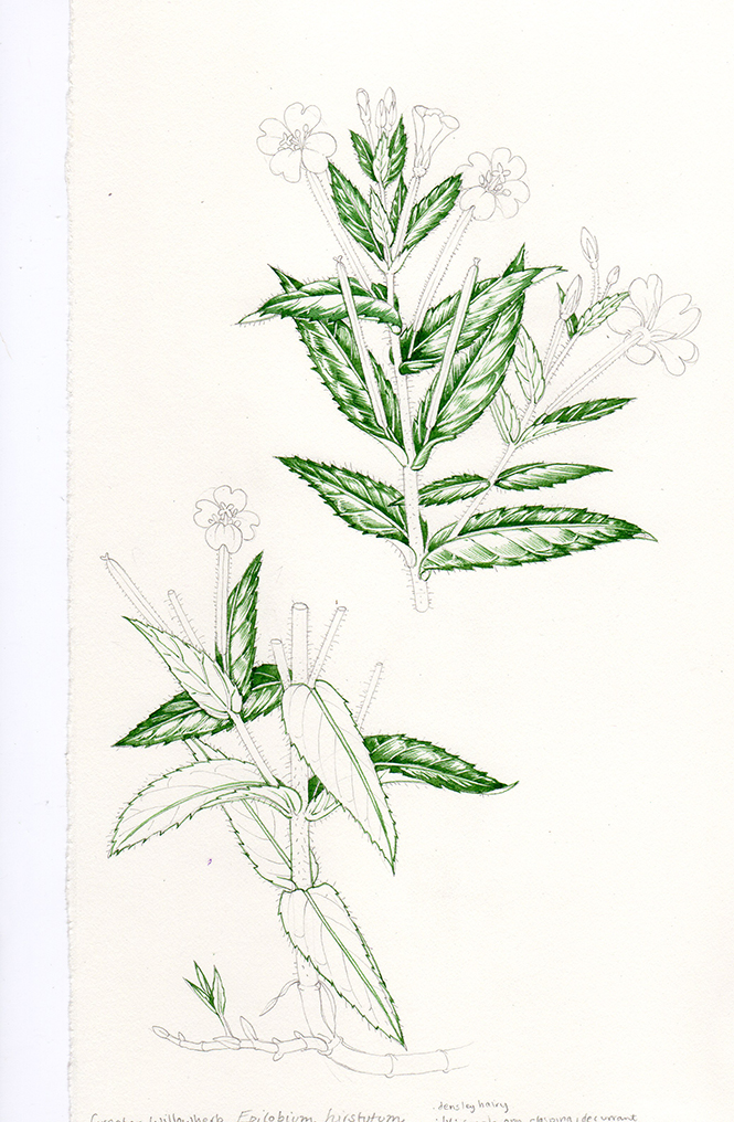
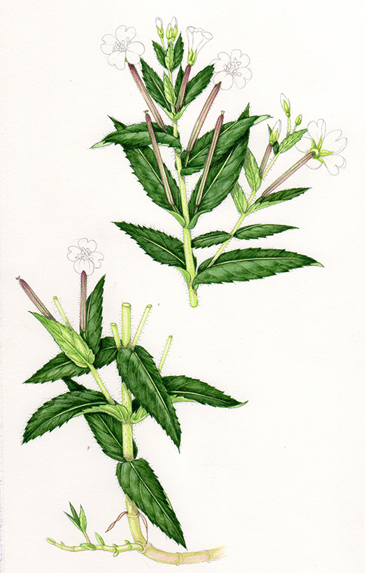
Plotting in the darkest greens on the Greater willowherb illustration
Midtones on the leaves
Next, I dilute the green paint with water, and work into the areas around the darkest parts of each leaf. It’s vital to keep the palest areas of each leaf clear white paper at this point, with watercolour you can always make a colour darker but it’s tricky to make it paler again without muddying the painting. Again, the structure of the leaf, dictated by the veins, is the map for laying these paler green regions down.
I leave the midribs white, painting either side of them but being sure to leave them clear of colour. The lateral or side veins may get a layer of this green, it depends on their position in terms of where the shadows fall onto the leaves.
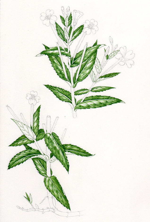
Second paler layer of green applied to the leaves
Painting the stems
A third green is now mixed, this is much paler and yellower than before. Sap green mixed with cadmium yellow pale, and a touch of turquise and yellow ochre. It’s quite a wet mix, which helps keep it pale. I paint the margins of the stems, the calyx, and the underside of the leaves with this colour. Then I dilute it to a paler shade and put a wash ontop of the calyx, tops of stems, pale regions of the leaves, and underside of the leaves. The midribs get painted with some of this pale green.
The stem is flushed crimson, but I’ll add this a little later, for now this pale green gives the definition required to show its form.
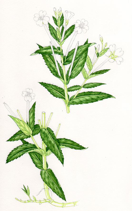
Adding a paler and yellower green to pick out the stems and calyx
Seed pods and calyx
With a bluer pale green (Cobalt blue added to the mix) I pick out the seed pods and elongate areas below the flowers, then cover them with a more dilute version of the same green. It’s important to allow the paint to dry between layers – luckily I use the paint quite dry so this doesn’t take long.
A yellow green (sap green and plenty of cadmium yellow) is used to pick out more detail in the calyx and buds.
I also use a windsor blue, hooker green dark, and purple mix to work into the darker areas of the leaves. This requires a bit of patience, it takes a while to build up the darkest areas of shadow without swamping the entire illustration.
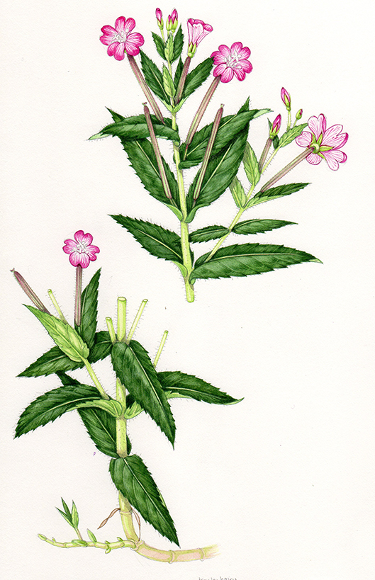
Working into the greens
A purplish crimson gets mixed up and popped onto the seed pods and distinctive lower bits of the flowers. This is Crimson lake, Violet, and a bit of Vandyke brown. I draw the edges of these structures with the paint, then once dry use an incredibly dilute verison of it as a pinkish top wash, carrying this onto the stem at the base of the Willowherb.
More work is put into darkening the darkest regions of the leaves with windsor blue, purple, and vandyke brown. Shadows aren’t black, so a mix of richer colours is always better than using a black paint direct from the pan or tube.
Adding purplish crimsons and working into the shadows
Colouring the flowers
Now for the fun bit, getting the colour onto the flowers. Willowherb have very distinctive pink flowers, it’s a dark magenta but slightly blueish, and very delicate. I mix up this colour using Opera pink, a tiny bit of Cobalt blue, and Doctor Martin’s inks (Quinacridone magenta 5H). This one bottle of ink is a key ingredient anytime I’m painting a plant with pink or purple flowers – radiant and clear without being overwhelming.
I use lots of small lines to build up both colour and flower detail, heavier toward the petal perimeters and much paler toward the centre of each flower. The underside of the petals is paler (as with the leaves) so requires a lighter touch.
Leaving areas of white paper within the flowers is vital, too much colour and they look dull and clumsy. This applies to the buds as well as the open flowers.
Plotting in the magenta of the flowers
As I reach the end of my illustrations I become increasingly absorbed by them, so fail to take enough “in progress” scans – apologies. Next I put a very dilute mix of the magenta over the top of the petals and buds, again, ensuring that the entre of each flower remains almost uncoloured.
The internal structure of this Willowherb isn’t too challenging; egg yolk yellow anthers held at the top of pale green stamens, and a white stigma. I used purple to delineate the details of this structure.
Finishing up: Flower details and shadows
Final touches are put to emphasise the darkest shadows, making sure any leaves which overlap others cast a drop shadow.
Next is the addition of the hairs. I used a mix of Yellow ochre and Hookers green to make a greenish yellow. Using my 000 briush I plot in the hairs over the entire plant (barring the petals, buds, and lowest stem), adding some hairs to the central regions of the stem as well as to the stem edges.
Next, I use Permanent white gouache, mixed quite thick, and the same tiny brush to pop in the hairs on the areas where structure overlaps a dark background. Also, to suggest hariy leaves, I put a few tiny white markings on the leaf blades.
Finished! Time for a cup of tea and to get out the next pencil rough that needs to be “coloured in”.
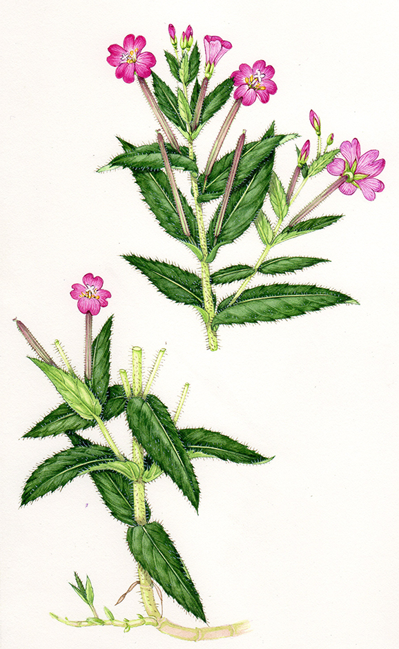
Final illustration of the Greater willowherb (hairs, body colour of flowers, stamens and stigma details added)