

Step by step Painting Bloom on a Fruit

In this blog, I’ll go through the steps involved in creating a life like botanical illustration of a fruit with a “bloom” or cloudiness on its skin, such as these Sloes (Prunus spinosa).
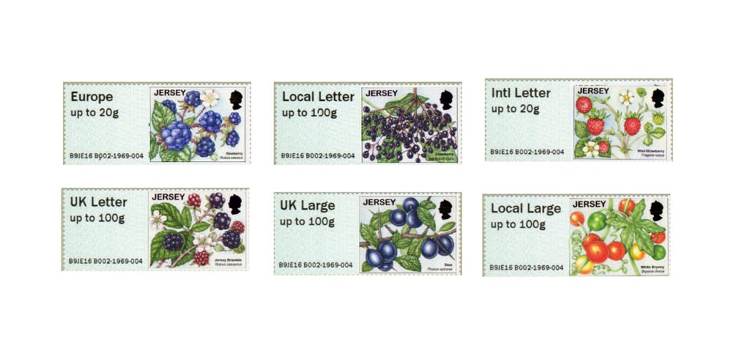
These feature on a series of stamps completed for Jersey Post in their Fruit and Berries issue, out now. (Click here for a blog on this job).
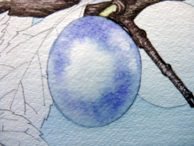
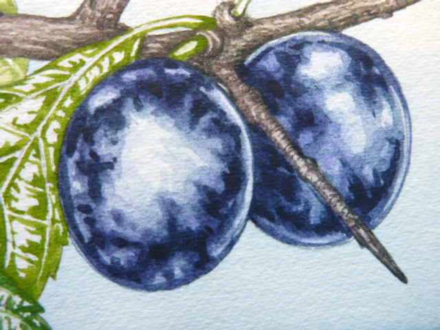
Bloom on fruit
Other fruit which have this distinctive blue-ish bloom on their skin include plums and grapes. Sloes differ from these in having a far blacker underlying colour, which you can see if you rub off the bloom on a berry.
It’s surprisingly easy to get the bloom on fruit effect, and I have to say a massive thankyou to the wonderful botanical illustrator Christina Hart-Davies who taught me how to tackle this subject, and is a maestro when it comes to capturing bloom on fruit.
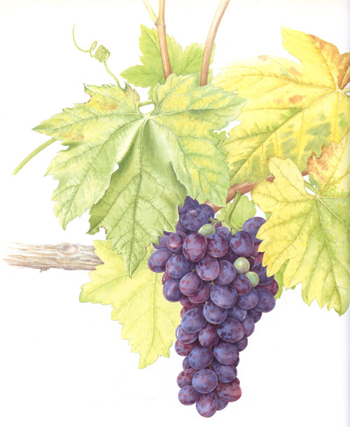
Grapes by Christina Hart-Davies
Step 1
The first step, once you’ve drawn up your illustration and are ready to paint the fruit is to cover the whole fruit with a layer of slightly mauve water. Mix this up by adding the tiniest amount of blue-purple to some clean water. Make this layer really wet, you want the paint you’re going to apply to the page to blur into it in an organic way, so no half measures!
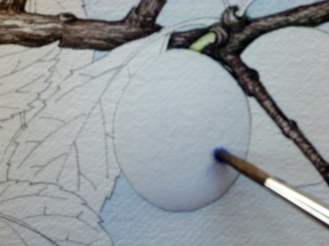
Step 1: Putting a very dilute wet wash on the fruit
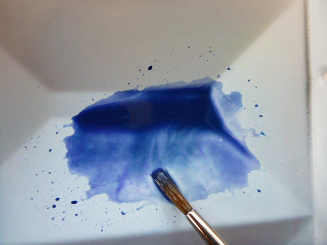
Step 2
Next, mix up a very wet purple watercolour mix. I used purple, cobalt violet, and cobalt blue; all Winsor and Newton paints. Apply spots of this mix to the body and margins of the wet fruit, making sure you keep the palest and highlighted areas clear of paint. Allow the purple colour to gently bleed into the water, then allow it to dry completely. Don’t be tempted to mess with it as it dries, or move onto the next step before the paint is fully dry.
Step 2: Purple wash seeps into the wet on the fruit
Step 3
Next, mix up a darker blue, less watery than before. I used winsor blue and some Cobalt purple.
Mixing up a good blueish purple
Use a really good brush (I always like the Winsor and Newton Series 7 ones). Now add some areas of this darker paint to the top of the dried painting. Don’t overdo it and go too dark, and remember to leave your highlights as white paper. A dark line delineating the base and top of the fruit can be a useful addition, if you blend it in with the dark blotches.
Step 3: Adding darker ares to the Sloe with a dry brush
Step 4
Once dry, and being brave, mix up a darker blue again (using indigo and greenish blues) and with a comparatively dry brush this time, pick out some areas of the darkest bits of the fruit.
Step 4: Adding really dark areas to the fruit
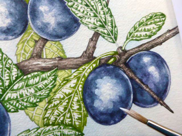
Treat all other fruit in the same way.
To be honest, I rather wish I’d stopped working on the sloe at this point. But the brief required a highly polished finished illustration. In working toward this I fear I lost some of the tonal spontaneity that I quite like in this stage.
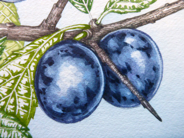
Step 5
Using a slightly less dark blue, work into the areas around the darkest darks, allowing there to be a gradation between the shadow and the light. These dark areas cross regions of bloom and highlight, so keep a look out for exactly where they fall and be true to your subject.
Step 5: Blend in the dark areas woth midtone purples
Step 6
Now mix up a watery white gouache, I use Winsor and Newton permanent white, and apply blobs of it to the edges of the brightest highlights. Try not to be too precise, the bloom on each fruit isn’t. Also, make sure you bring some of this white around to the very edges of the fruit, not only to the central highlighted area.
Step 6: Adding white gouache
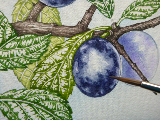
Step 7
Yet more work into the darks is needed, so pop some more depth into the darkest regions of shadow.
Step 7: Add darker areas ontop of the gouache
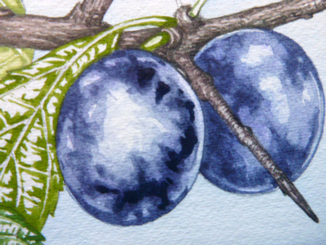
Step 8
Now, with your heart in your mouth, closely observe the fruit in front of you. Where the bloom has been scratched off and grazed (as it inevitably is in places) you reveal the almost black fruit below. Using a very fine brush, pick out these tiny details. Don’t be half hearted about it though, these need to be definite decisions and accurate, bold paint brush strokes.
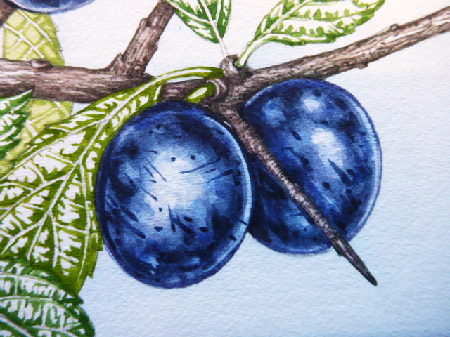
Step 8: Add scratches and pock marks
Step 9
Last step is to add tiny brown and magenta markings to the skin, which can be seen on most sloes if you peer long enough. The brown is a red hue, Vandyke brown with Cadmium orange light. The purple is Opera pink with Cobalt violet and a touch of Alizarin crimson. The brush marks need to be very discrete, observe the fruit carefully and replicate them on the page as closely as you can.
Step 9: Add brown and pink details
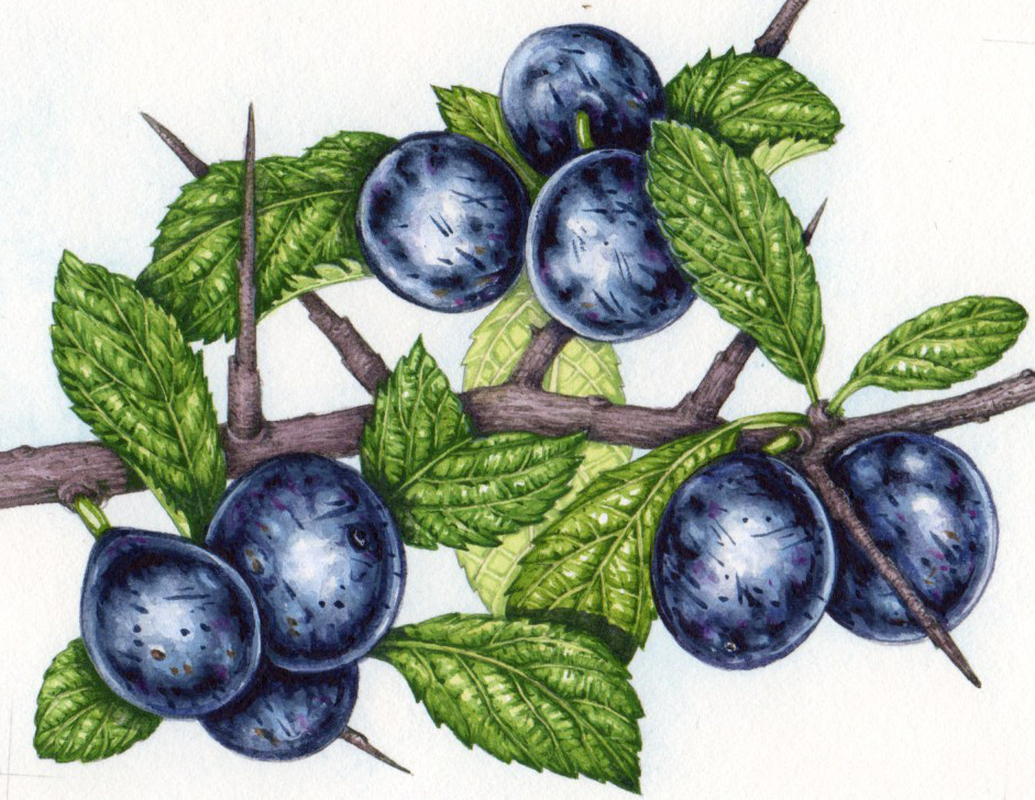
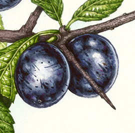
A few final touches of a very dark blue, almost black, and the illustration is done. The scan below is slightly misleading as it is of the finished plant, so the leaves and fine details of surrounding areas are also finished. The illustration was also scanned not taken by a camera, hence the discrepancy between the black of the image below and the blueness of the earlier photos. (The scanned image below is truer to the colour of the final illustration.)
Completed Illustration
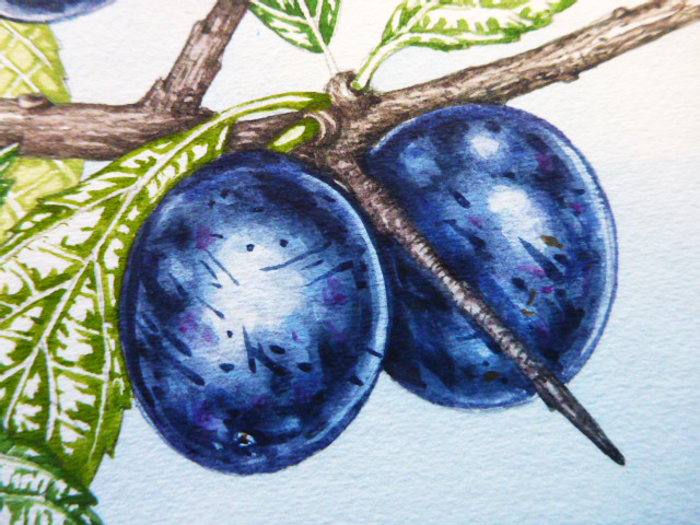
Detail of Sloes illustration
And here are our two sloes with the rest of the plant.
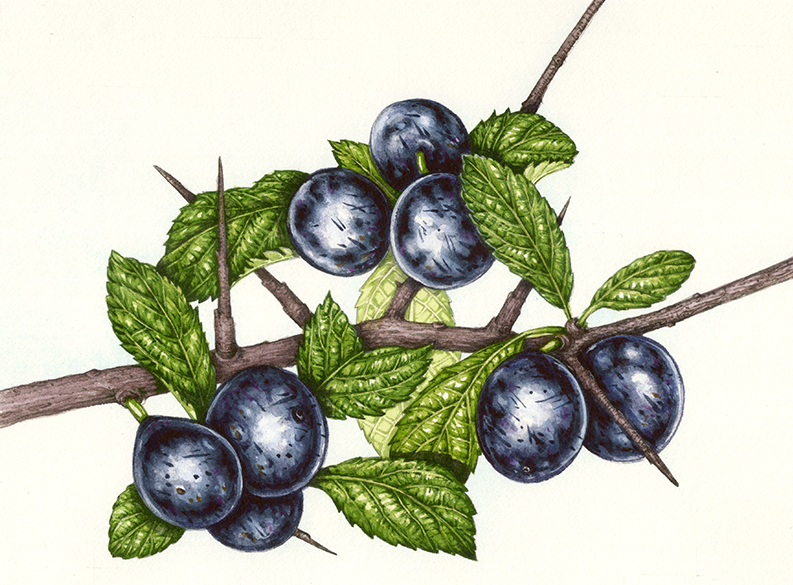
Final Illustration: Sloes, completed for (and copyright of) Jersey Stamps 2017
I doubt I’ll ever manage the sublime subtlety of Christina Hart-Davies’s work on fruit bloom, but by following these steps, many of which were a revelation to me (working wet on wet? Using blobs of white gouache? Putting in dark scratch and pock marks? Who knew?), I think it’s possible for everyone to give it a go.
For more of my step by step botanical illustrations blogs, click on the link.
Hi lizzie! Thank you for this tutorial. My problem is how I can draw before the painting. Please any suggestions or do you have resources on that too?
Hiya Naa
Thanks for the comment. Yes, I know. Its all very well talking about how to add colour, but how to draw in the first place? Well, Id say practice. Shed inhibitions and expectations. And do it for at least 20 mins a day, maybe in a sketchbook. And draw ANYTHING. No shadows to start with, just lines. Two good tricks are blind contour, and gesture drawing. Blind contour involves drawing without even peeking at the page. Just pop your pencil on the page, keep it there and moving, and stare at what youre drawing instead of the page. The Gesture drawing means just scribbling your way round a picture, lots of scratchy marks and eventually perhaps seeing an image emerge. I also wonder if my guest blog on drawing might have some ideas too: https://lizzieharper.co.uk/2018/07/guest-blog-seven-drawing-exercises-by-nathan-hughes/? Main thing though…just do it! And good luck, and dont get disheartened. You dont need to show drawings to anyone, and please be sure not to judge yourself as you evolve. x