

Illustrating a Water Meadow Landscape

Getting started on a Water meadow landscape
I was recently commissioned to complete a large natural history natural science watercolour illustration of a landscape. Woodstock is a water meadow habitat; the illustration would feature my wildlife and botanical illustrations of the species there. This illustration will be used on an interpretation panel, and was a challenge and a joy to create.
Linda Francis is a designer friend I’ve worked with before, so I was more than happy to take on this job for The Wychwood Project and Woodstock Town Council.
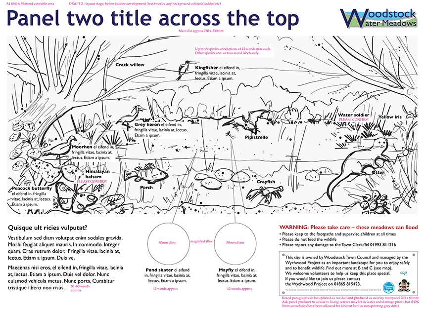
There are to be two interpretation panels. One will have archeology information and is to be illustrated by another illustrator (Jennie Anderson). Mine is to focus on the wildlife and plants.
Working on the pencil rough
My approach to these animal-rich landscapes is always the same – piece it together like a landscape jigsaw. (Here’s a link to other blogs on a similar theme; Malham Cove and Hartslock landscape).
I was lucky enough to have a rough that Jennie had already worked up; this simplified things enormously.
thumbnail illustration by Jennie Anderson
I worked from this to plot in all the required elements. There are a lot of invasive species involved in this landscape, from plants to crayfish, and we were keen to show the impact (positive and negative) these species can have on the habitats they inhabit. For example, the American signal crayfish outcompetes and even predates on the native White clawed crayfish; whereas the Water soldier can provide shelter to aquatic invertebrates.
Once I found my references, I placed the animals on the page as pencil line drawings.
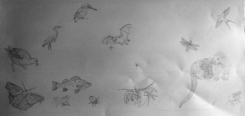
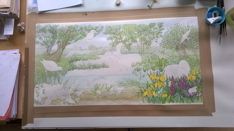
Woodstock rough: Placing the animals on the page
This illustration is quite an odd size, very large, and long and thin. This was to prove a challenge when it came to stretching the paper as the paper itself was only 1cm wider than the finished painting, but it also meant I had to ensure the plants worked extra hard to keep the composition flowing across the page – water weed needed to carry your eye across the pond, and willow branches had to take the viewer from one side of the landscape to the other.
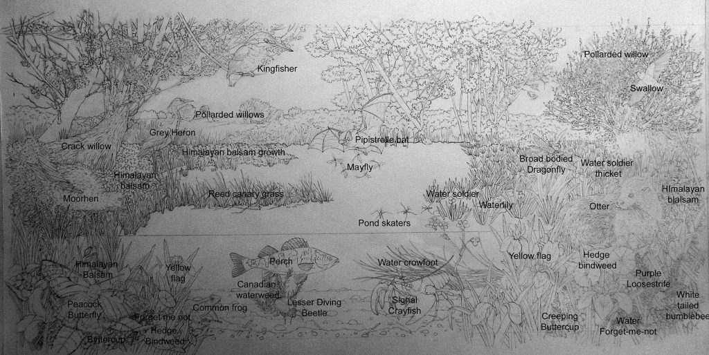
Woodstock rough (annotated)
Once drawn up, I provide the client with a clear and an annotated version of the rough and wait for feedback. In this case we introduced a different scene for the crayfish, but otherwise made very few changes.
Painting the background landscape
First step (after stretching the paper with the thinnest imaginable margin under the gummed tape, then having to stretch it all over again!) was to cover the whole sheet with a pale blue wash. This was followed with a pale ochre wash over everything except the elements right at the front of the illustration. This means only the parts of the painting closest to you will have bright contrast provided by the untouched pure white of the paper below. All other parts of the landscape are slightly muted by these blue and ochre washes. Next comes the long business of painting in the distant landscape and trees in very pale watercolour. They require enough detail to seem convincing of distance and species.
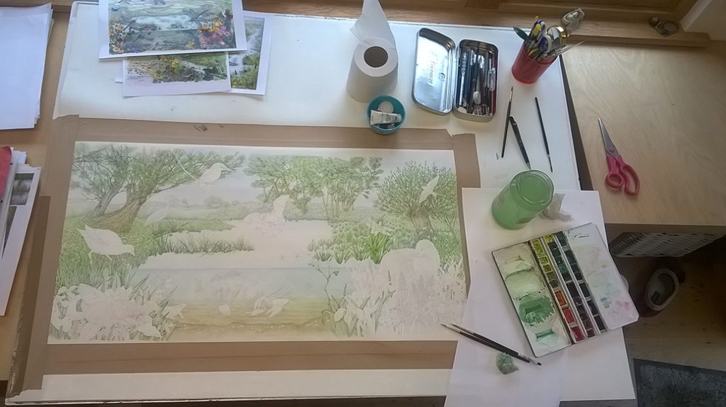
Illustrating the vegetation and plant species
Then, with colour becoming more intense and saturated as I paint toward the front of the illustration, I work into the plants and water margin vegetation. This process takes a really long time, but isn’t tough, just somewhat repetitive.
Painting in the plants and vegetation
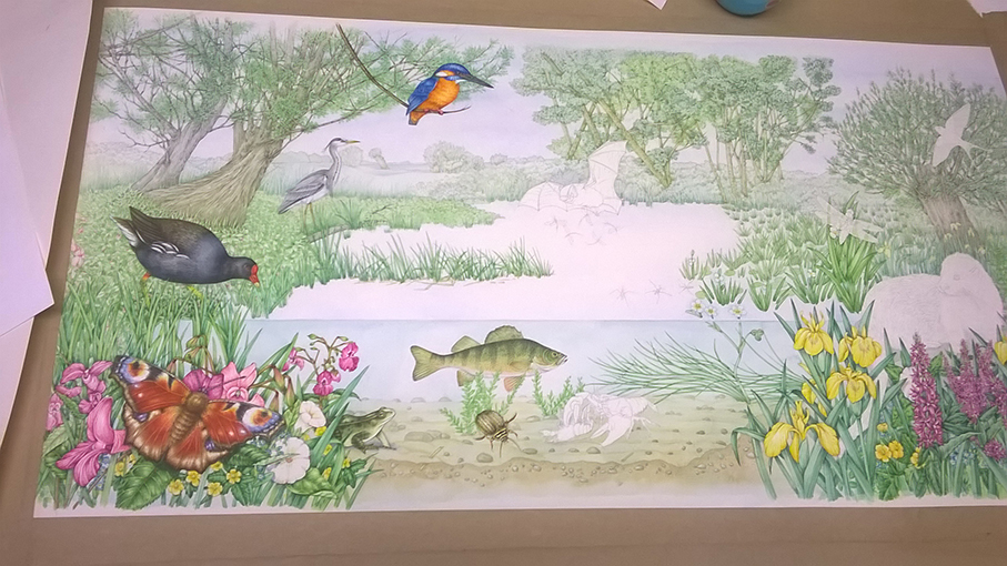
The end result is a landscape with animal-shaped jigsaw pieces missing. From now on it gets really fun to work on! Below you can see the spaces where (starting on the right, and spiralling in) the otter, dragonfly, swallow, kingfisher, perch, lesser diving beetle, and crayfish pair will slot in.
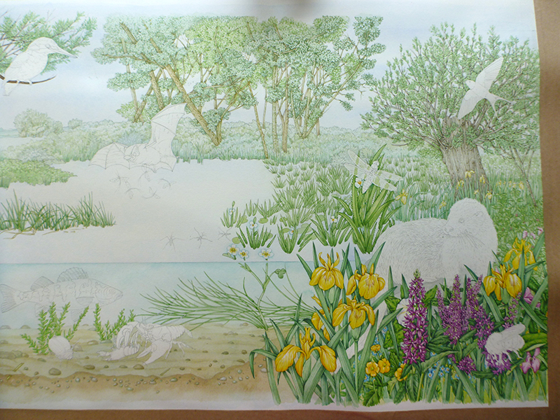
Illustration of water meadow waiting for the animal species to be slotted in like jigsaw pieces
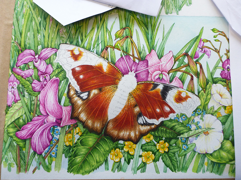
Adding animals: Peacock butterfly
I was so happy working on the Peacock butterfly, they’re stunning insects so it was a joy to get lost in the intensity of colour and contrast with a tiny Winsor & Newton series 7 sable brush. I worked into each colour in turn, and inevitably the work gets easier as more of the colours are plotted in.
Working on the Peacock butterfly
The dark areas of the upper wings were the last to be painted in.
Woodstock landscape detail: Peacock butterfly
Illustrating the animals: Birds on the left hand side of the landscape
Keeping to the left hand side of the illustration (I’m right handed, so I lean on a sheet of paper laid across the right hand side of any work, hence I always work across the page from left to right to avoid damaging completed areas of the painting) I painted in the Grey heron and a bit more tonality in the marginal vegetation.
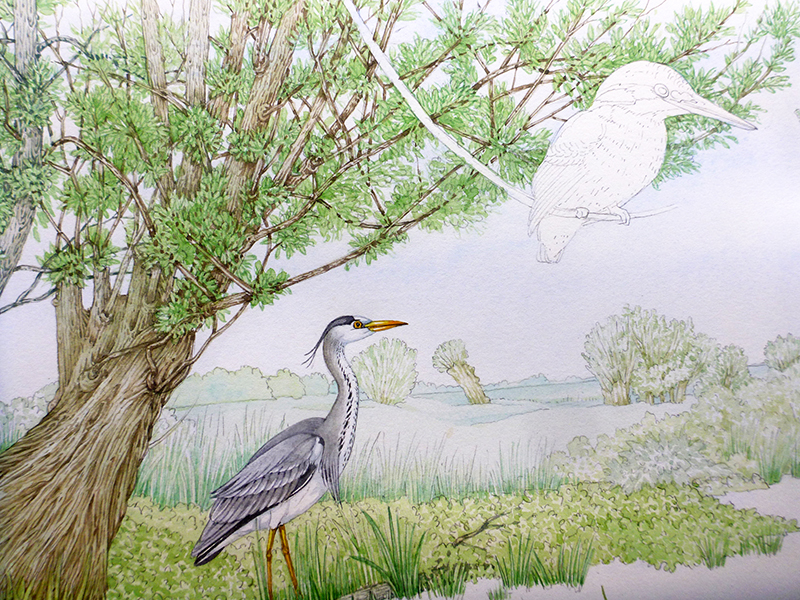
Grey Heron in the landscape
Here’s a close up of the heron, you can see that because it’s in the distance I’ve kept the contrast and colours muted.
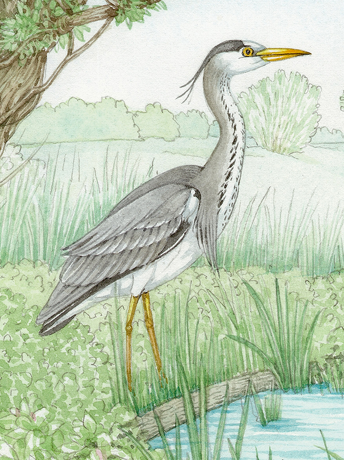
Heron illustration with muted colours
The next jigsaw piece to complete was the Kingfisher. The jewel-like colours on this bird make it a joy to paint, but also a challenge. If the blue and orange overlap you’re left with a muddy brown (and a very non-kingfisher-like) mess.
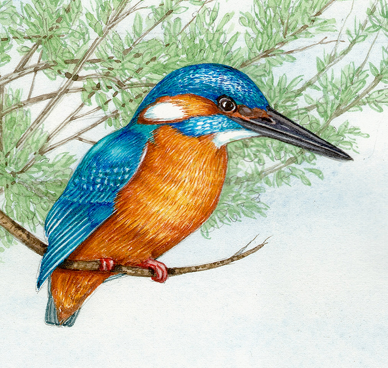
water meadow landscape detail: Kingfisher
The Moorhen was next, with its distinctive bright yellow legs and sombre plumage.
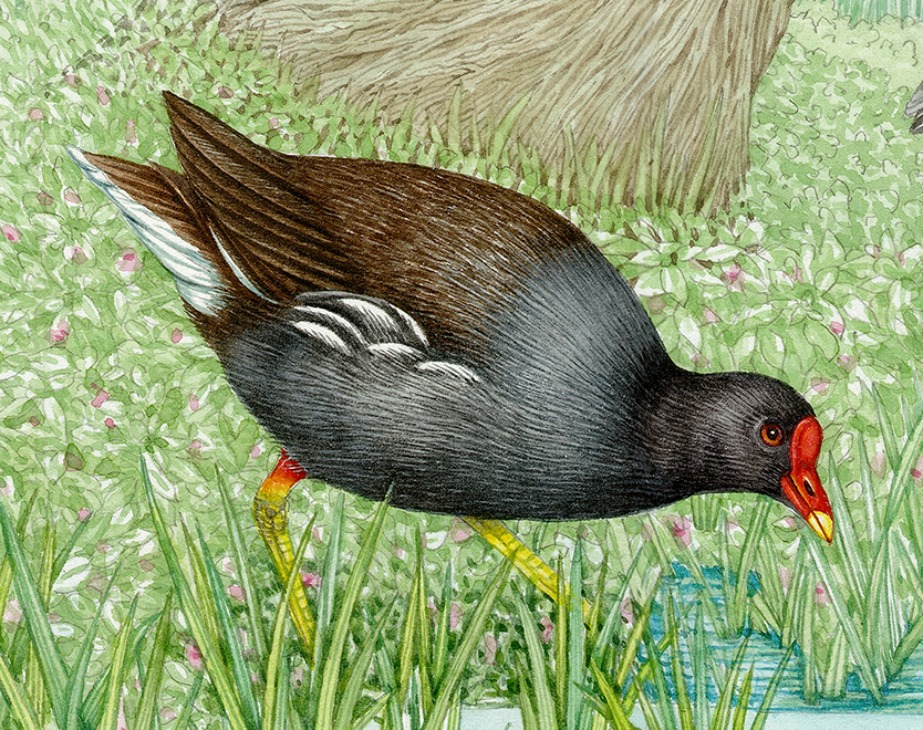
water meadow landscape detail: Moorhen
Painting the underwater scene
Moving across the page, the next area needing work was the underwater scene. I added more to the water itself, then worked into the Perch. Fish are tricky as you want to avoid painting each individual scale, but need to give some suggestion of the texture of the animal. This fish is also in the middle distance so I had to keep the contrast and intensity of colour limited.
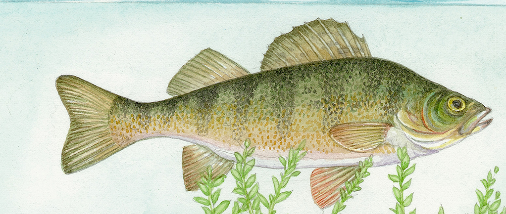
Under water detail: Perch (again, muted colours to imply the fish is a little way back from the viewer)
The lesser diving beetle followed; this animal was simple as it is pale yellow with darker mottled marking on top.
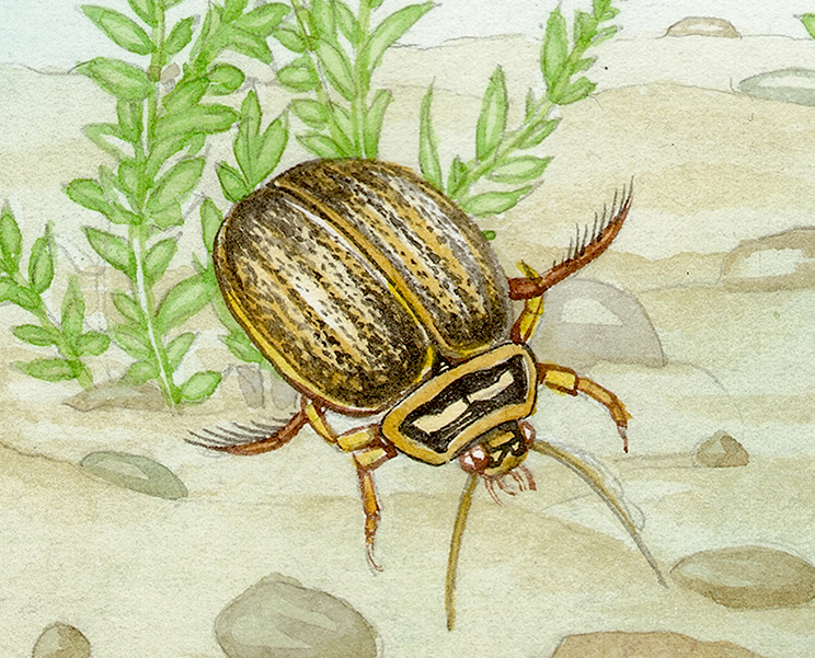
Under water detail: Lesser diving beetle.
Illustrating the Crayfish predation vignette
Most of the underwater scene is done, and I have to face up to the not inconsiderable challenge of painting the Signal crayfish predation on its smaller British white-clawed cousin.
Water meadow landscape in progress: Next up, the pair of fighting crayfish!
In truth, this part of the illustration had been troubling me as the potential to mess it up was enormous. I had to make the species look different from each other, but also ensure that the drama of the situation was clear. Luckily, some purple drop shadows helped hold this vignette together.
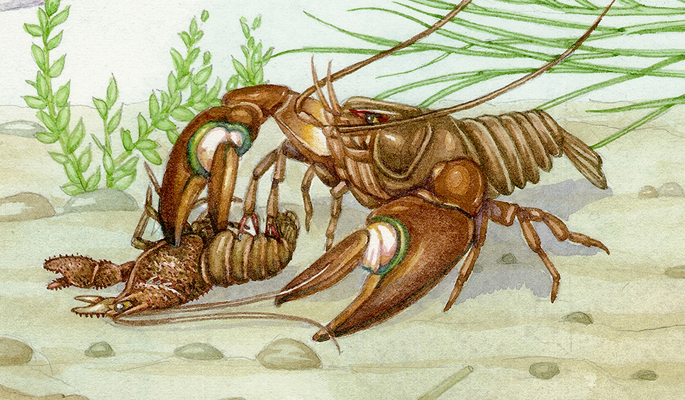
Underwater detail of Signal crayfish predating on the white clawed crayfish
The underwater part of the illustration was now finished and I breathed a sigh of relief.
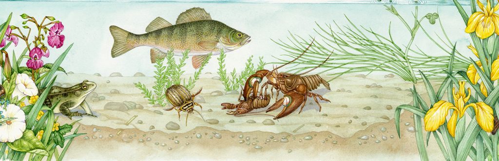
Woodstock water meadow: Underwater area completed
Painting a bat, a dragonfly, a swallow in flight…and an otter
Next up were the tiny mayflies and the Pipistrelle bat. The challenge here was to ensure the bat looked like it was about to eat the mayflies, and that the mayflies were both clear and obviously in front of the hunting bat.
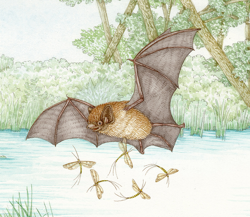
Detail: Pipistrelle bat with mayfly
Over on the left hand side of the illustration there was an area of water soldiers that needed touching up, then a Broad bodied chaser dragonfly and some pond skaters to paint in.
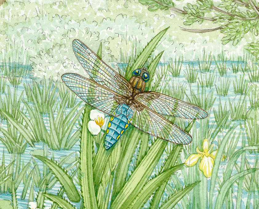
Detail: Broad bodied chaser dragonfly on Water soldier
The swallow against the willow tree (I love the shape of these distinctive old pollarded trees) was a swift “colouring-in” job as it’s mostly white except for that stunning flash of scarlet on the chin.
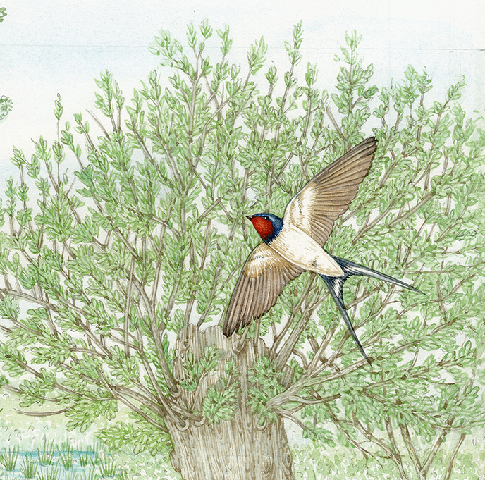
Woodstock detail: Pollarded willow and swallow in flight
The last animal to be painted in is the otter. I never enjoy painting these wonderful mammals, they have a tendency to look like dogs, and somehow I have a block when it comes to the shape of their muzzles and skulls. In this case the head went ok, but I got the colour of the fur terribly wrong, leaving the otter a bright orange hue. Judicious use of the opposite colour on the colour-wheel (greens and purples) knocked the colour balance to an acceptable shade of brown, but it was a challenge. Whiskers and the eyes were the last bit to be added.
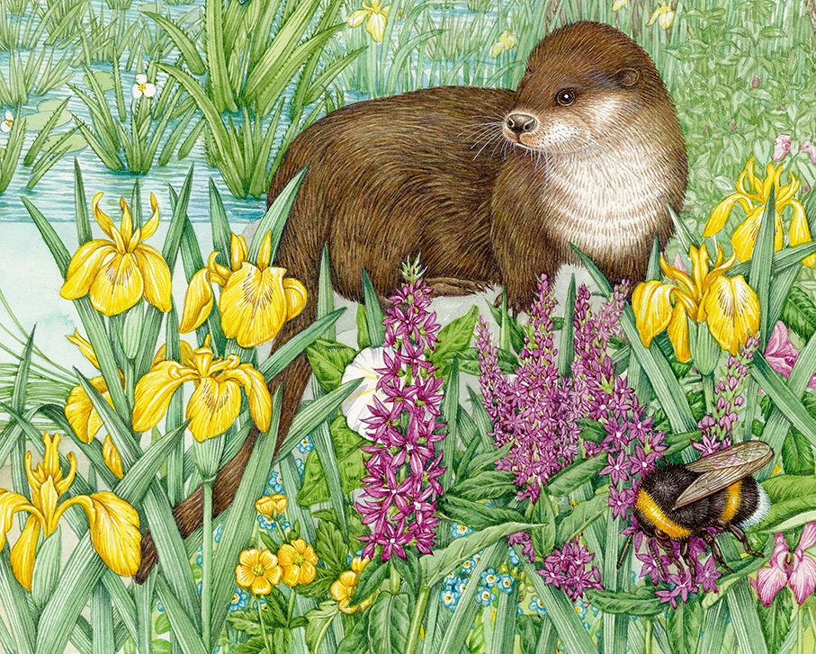
Woodstock water meadow detail: Otter and White-tailed bumble bee
Adding depth by adding shadows
Finally, with all the elements of the illustration painted in I worked into the shadows and areas of dark in the water. It’s always easier to do this once the whole illustration is finished.
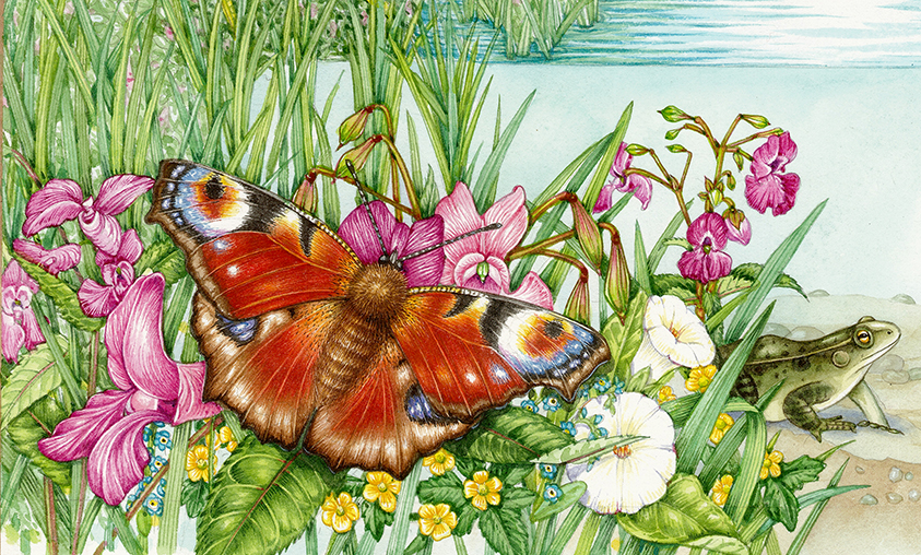
And there we go, the whole painting is finished and ready for scanning! It was a real challenge because of the scale of the illustration and because I was working on a watercolour paper I’m not accustomed to (Arches HP). However, I’m satisfied with the result; in fact there are some bits I’m really pleased with (the butterfly, distant fish, pollarded willow trees, and the moorhen). It was a lovely job for the start of the summer, and I loved the 2 weeks I spent on it. Can’t wait to see it in context as an information board soon!
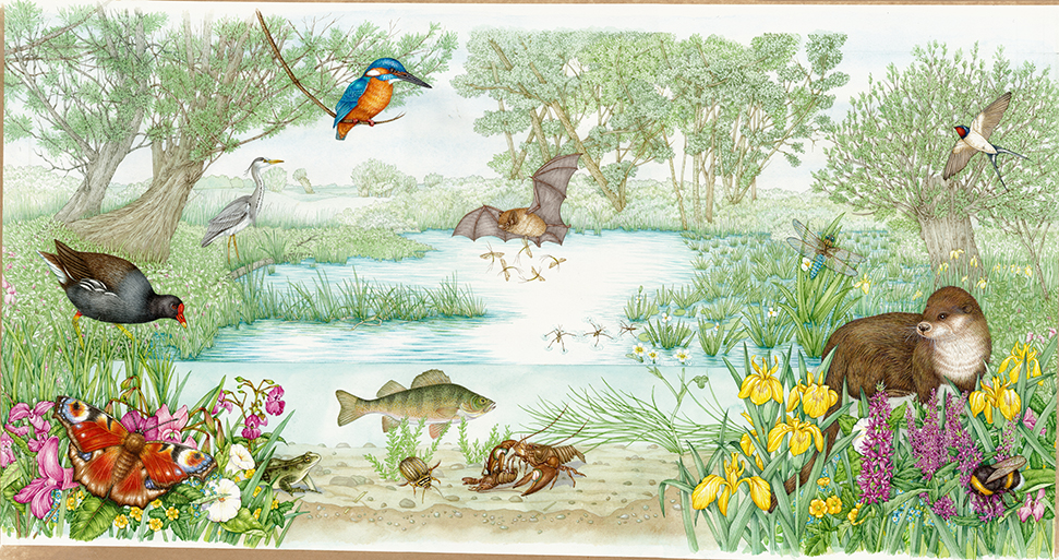
Finished Woodstock Water Landscape Illustration