

Botanical Illustration: Comparing HP Watercolour Papers 2
This is the second of three reviews of watercolour Hot Press papers for botanical illustration. Please check out the first and third in this series for more tests and results!
As a botanical illustrator, having a good hot press watercolour paper to work on is really important. Unfortunately, recently the paper I used to use, Fabriano Artistico, has had some changes to its manufacturing process and is no longer quite as wonderful as it was.
I, along with lots of other botanical illustrators, am busy testing alternatives to see what papers are out there, and how they work for us.
In a previous blog and youttube video I tested Arches HP, Moulin du Roy hot press, Canson Heritage HP, Saunders Waterford HP, and Botanical Ultra Smooth. Of these, my favourites were Arches and Moulin du Roy, both of which I’ve been using since making my comparisons.
Watermeadow landscape painted on Arches Hot Press (click here for blog on this illustration)
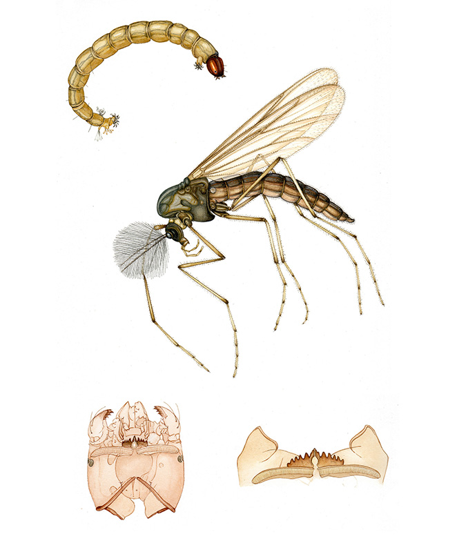
Chironomid midge painted on Moulin du Roy (click here for blog on this illustration)
This week I’ve been putting two other suggested papers through their paces; these are Stonehenge Aqua Hot press and Fluid Hot Press Watercolour paper. For a Youtube version of this blog, please click here.
As before, I want to stress the fact that everyone paints in a different way and feels differently about the paper they work on, so what works for me may be disastrous for you and what is dreamy for you might be hopeless when I try to paint on it.
Stonehenge Aqua
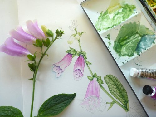
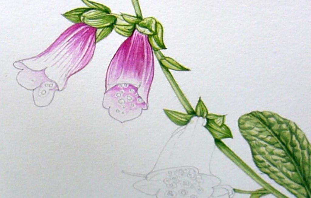
Saying that, I’m feeling quite cheerful about the first paper, the Stonehenge Aqua. I chose to paint a foxglove from the garden. The paper feels smooth and hard, and takes graphite well. The pencil does seem to bite hard into the page, and there are dents left after rubbing out.
The watercolour sits nicely on the page. It doesn’t seem to bleed, and when you pop washes on top of areas of detail (the way I work) the detail doesn’t move. The paint is mobile in response to the brush but doesn’t clog or bleed, even if several layers of detail are applied.
Foxglove progress on Stonehenge Aqua
Big areas of light wash work well, you can move the paint around as it doesn’t instantly stain the page. It blots well, allowing you to lift the colour without compromising the paper surface.
Foxglove illustration on Stonehenge Aqua, getting colour on the flowers (apologies, it’s a little out of focus)
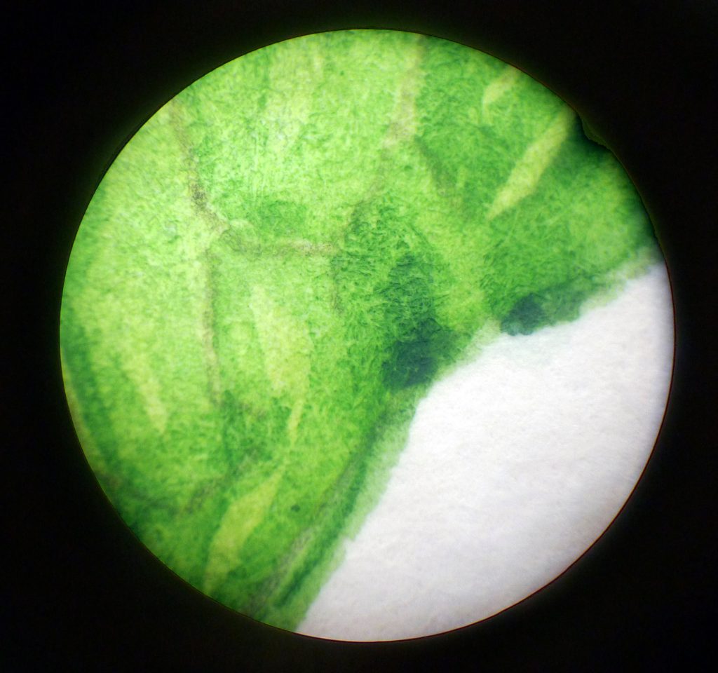
Stonehenge Aqua under the microscope
Under the microscope you can see there’s almost no bleeding of colour.
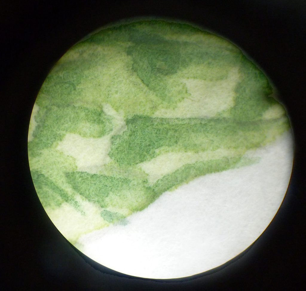
Stonehenge Aqua with paint on under the microscope
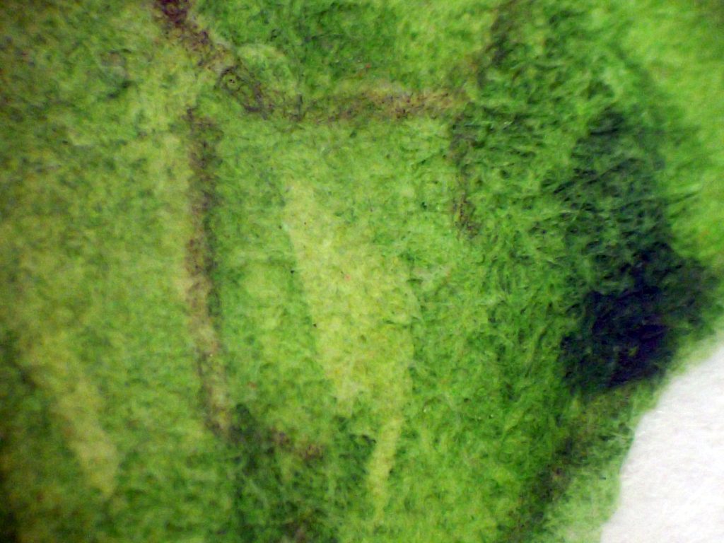
Even closer, you can see that each fibre is quite short and flat to the paper. Even at this magnification you can see how little bleed there is. However, the paper looks a bit soft and cottony, perhaps this is why some of the vibrancy of colour seemed to be swallowed up?
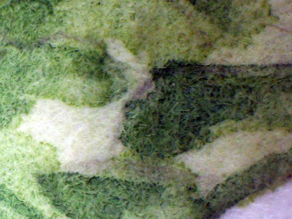
Up close under the microscope: Stonehenge Aqua
In fact, this is my only criticism of Stonehenge; it seems to swallow some of the density of the colour. I painted as I normally do with bright colour, and the finished piece has a pastel-like and soft feel to it. The edges are crisp, but the hues are gentler than I applied.

Foxglove sketch on Stonehenge Aqua with specimen
However, it’s definitely worth working with a little more, I’m adding it to my stable of Arches and Moulin du Roy as a potential replacement for the much-missed Fabriano. To me, it felt similar to Arches HP although a touch less prone to bleeding, and a little easier to move paint around on.
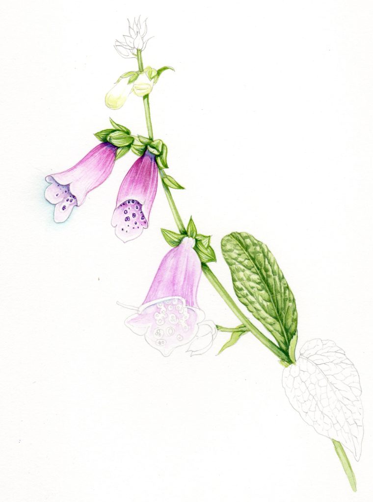
Finished Foxglove sketch on Stonehenge Aqua
Fluid Hot Press
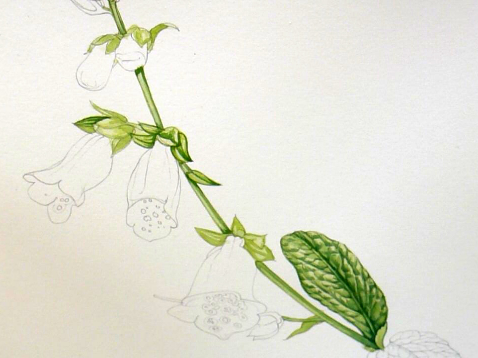
Next I tried Fluid Hot press watercolour paper. This feels incredibly hard and smooth, and is dreamy to draw on with graphite, the pencil slides across the page. Slight drawback is a squeak every now and then from the pencil, but the feel of the pencil on the page is lovely and the line shows up beautifully. Rubbing out is a little less pleasing as it takes some effort, but the paper doesn’t seem dented afterwards and it doesn’t change the ability of the page to take paint well.
Using watercolour on this paper was wonderful. Incredibly crisp and tight lines, no bleeding, and I was convinced it was allowing me to work into the details and add washes without losing any of the work I’d already laid down.
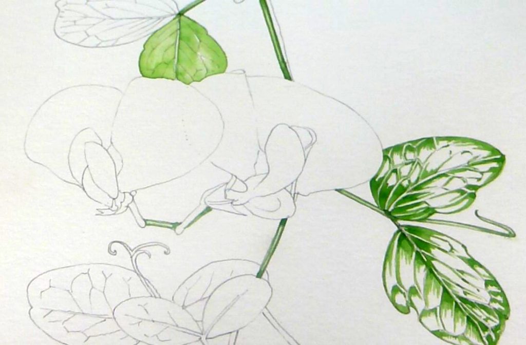
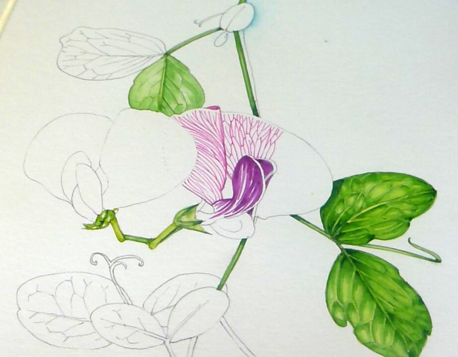
Sweet pea on Fluid Hot Press
The lines of paint felt really sharp, and the colours almost glowed.
Sweet pea detail on Fluid Hot Press
However, when it came to putting a third or fourth top wash on, some clarity was lost and the underlying lines were compromised, and seemed almost to have been lifted from the page, leaving a bleached area instead.
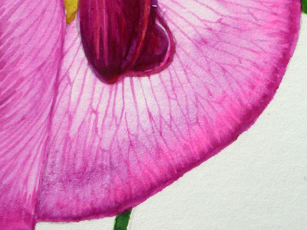
Detail of the way top washes of paint lifted the lower painted lines from the paper.
I was gutted about this as I really thought I’d stumbled on the answer to my problems.
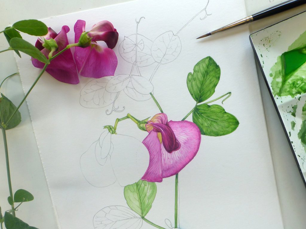
Sweet pea sketchbook study on Fluid hot press, with specimen
Fluid 100 Under the microscope
Under the microscope you can see there’s very little bleed and a real vibrancy of colour.
Painted area on Fluid Hot press under the microscope.
On closer inspection you can see how compressed the fibres are, they really are flat to the surface of the paper. They’re also very good at limiting bleed. It would have been interesting to get the area that messed up (the large washed area of petal) under the microscope too to see what went wrong. I suspect the detail simply lifted off, this is almost inevitable with a paper as china-smooth as this.
Closer microscopic detail of paint on Fluid paper
Saying that, the paper held up well and was particularly good at hanging onto the glowing brightness of the paint, it didn’t feel like the colour faded after application. It was good for pale washes and blotted well.
My only reservation is that big loose layers on top of highly detailed under painting may not work as well as I would like, but overall I preferred the act of drawing and painting on this to the Stonehenge HP. However, the study of the sweet pea is less successful than the foxglove, so that’s worth bearing in mind too.
Finished Sweet pea sketchbook study on Fluid HP
Conclusions? Clear as mud. Both of these are well worth a try. The Stonehenge feels similar to Arches HP. The Fluid is reminiscent of Moulin du Roy. Neither is as wonderful as Fabriano Classico used to be, but both are workable and good papers. I feel encouraged.
I have been trying to find an alternative to Arches Hot Press paper for botanicals, and I came across your blog posts.
Unfortunately I can’t get my hands on Fluid 100, but I have tried the cellulose version, and I have to agree – too many wet washes, and the paper is not performing well.
Still, I REALLY like the fact that there is no smell from the paper as it’s a cellulose type. There is some ugly smell om Arches papers that I just hate. Really.. Yuck!
So, Fluid cellulose has actually won my heart. It is not the best for every botanical painting, but for some it works VERY well. I have found that if you let the layers dry completely between layers, you almost won’t have any issues. That’s my experience at least. If the paint hasn’t dried completely, the colors between layers will merge a bit.
Thank you for these posts! It has made find a new brand which I think will be really great for my paintings!
Hi Annette
This is interesting, and so lovely to find a paper you like. If you can get your hands on it, try Stonehenge aqua by Legion papers too, that’s another “go to”. But Im pleased youve made the Fluid cellulose work for you. Hooray!