

Step by step Botanical illustration of Hawthorn berries
In this blog I’ve broken down the steps involved in painting the berries of the Hawthorn Craetegus monogyna. This approach works just as well for any red shiny berry, although you’ll need to take care with what hue of red you mix. The real secret to getting these berries looking properly shiny is to ensure you leave enough of the white paper showing, this serves as the brightest white shiny highlights on the berry.
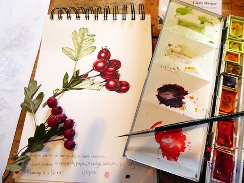
First, choose a decent sprig of hawthorn to work from, with several berries on. These become darker and more crimson as winter progresses, but if you keep an eye out you’ll still be able to find some which are worth painting.
I got the leaves of my hawthorn sprig painted up first, so I could focus all my attention on the berries. I use a Pentel P205 mechanical pencil (H lead), a soft rubber, winsor and newton watercolours, a trusty series 7 sable winsor and newton brush (number 1) and worked onto an RK Fatpad sketchbook (available from lots of art material suppliers), this one has the old Fabriano classico paper in.
Step 1:
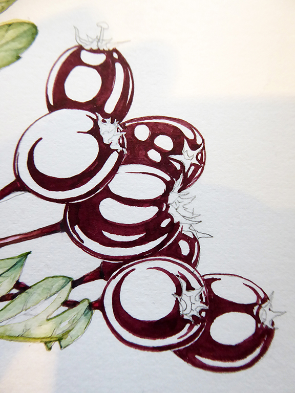
Draw up the berries in pencil line. Be sure to only make one clear line, furry lines aren’t very helpful when it comes to using watercolour.
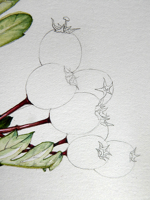
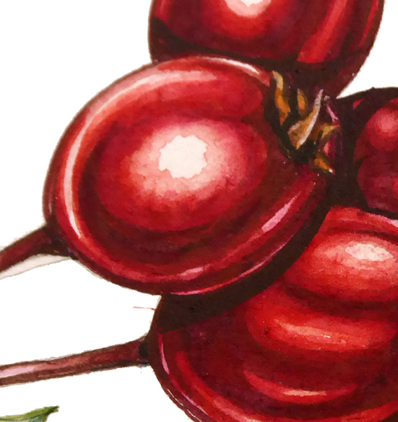
Be sure to draw the shape of each individual berry as accurately as possible and don’t be afraid to look really closely at the residual remains at the tip of each berry, these help the berries look real.
Here’s a close up view.
Step 2:
Mix up a nice dark hue. For this Hawthorn I mixed purple with Alizarin crimson, Vandyke brown and a touch of a dark blue. Experiment with your mixing until you’re satisfied it looks right. You can even test the paint by applying a tiny bit to the berry itself, and you should always pop a bit on some watercolour paper to ensure it looks as good on the page as it does in the palette.
Paint in the shapes of the darkest parts of the shadow on each berry, leave any areas which are shiny as white paper. Be brave about where the edges of these dark areas are, we’ll soften these in the next step.
The paint needs to be mobile but not too wishy washy; it sounds unpleasant, but it should be more or less the consistency of blood. Let the paint dry fully before moving onto the next step.
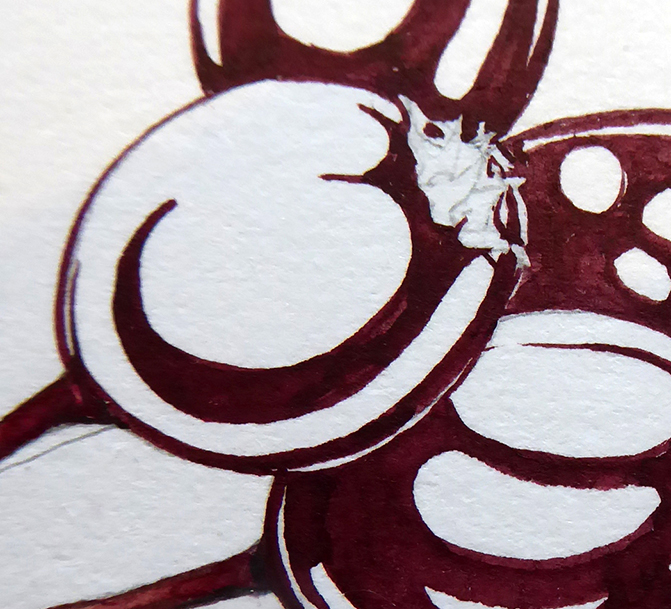
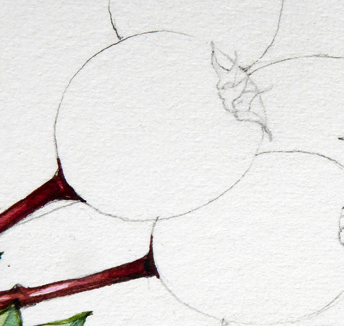
Here’s a close up of the berries with this dark layer dry and ready for the next step.
Step 3:
Mix up a brighter red. I used Alizarin crimson and Cadmium orange dark with a touch of yellow. Leaving out the blue and brown and purple pigments explains why the hue is brighter than before. Use water to make this mix a little paler (to make what’s known as a “tint” of the colour), then paint this over the top of the dark areas, and around the edges of your highlighted area.
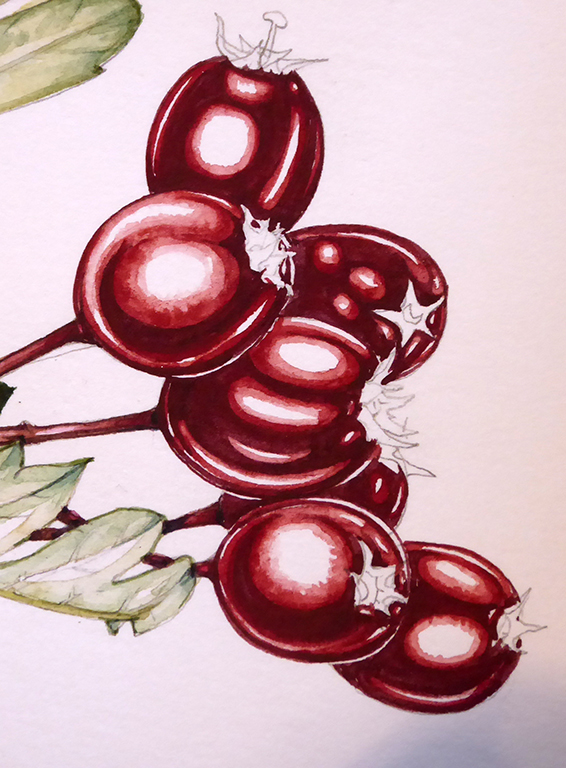
Use clean water to soften the edges of this colour where it touches the white, and even blot slightly with a tissue to soften it further. Make sure you still leave plenty of white paper to show where the shine is!
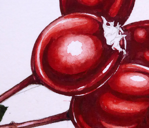
Here’s a close up so you can see the concentric lines of paint; dark shadows, reddish hue, watered down tint (with blotting apparent in some places), white paper. Let the paint dry fully before moving onto the next step.
Step 4:
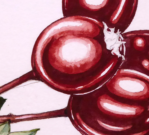
Mix up a paler orange colour. This one was made by mixing Cadmium orange dark with cadmium orage light.
As before, make a tint of the colour by diluting it with water. Paint this over the berries and into the edges of the remaining areas of highlight. Try not to cover the white areas completely. Allow this colour to cover the less shiny highlights, they’ll still read as shiny, but less shiny than the brightest areas.
Be sure to leave some of the white paper still showing – don’t cover it all with colour! Let the paint dry fully.
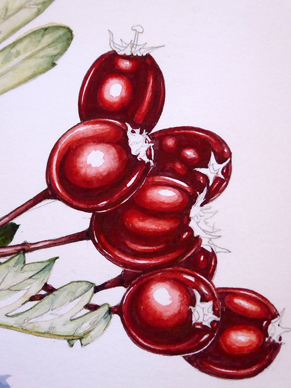
In this close up you can see how the layer of orange red has added to the depth of colour of the berries.
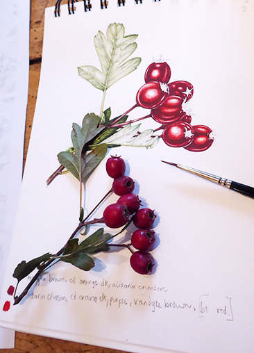
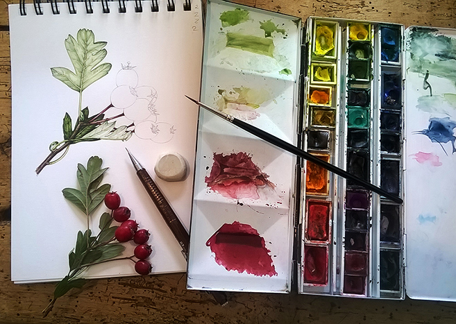
Here’s a photo of my sketchbook and the sprig in progress, you can see the colour notes at the bottom of the page where I’ve tested out my mixes.
Step 5:
Paint the details of the berry tips – this is mostly browns and yellow ochre with a touch of red.A pale wash of a pink light Crimson lake can be put over the berries (but not the brightest highlights), knocking back the highlights on the under part of each berry.
Leave your highlights white.
Mix a dark hue, I used Winsor blue with Vandyke brown and Purple, and apply this carefully to show the darkest shadows on the berries. Less is more at this point, don’t take the whole berry to a really dark colour. You can see where this dark mix has been used as a drop shadow beween the top and lower berry, and near the stalk.

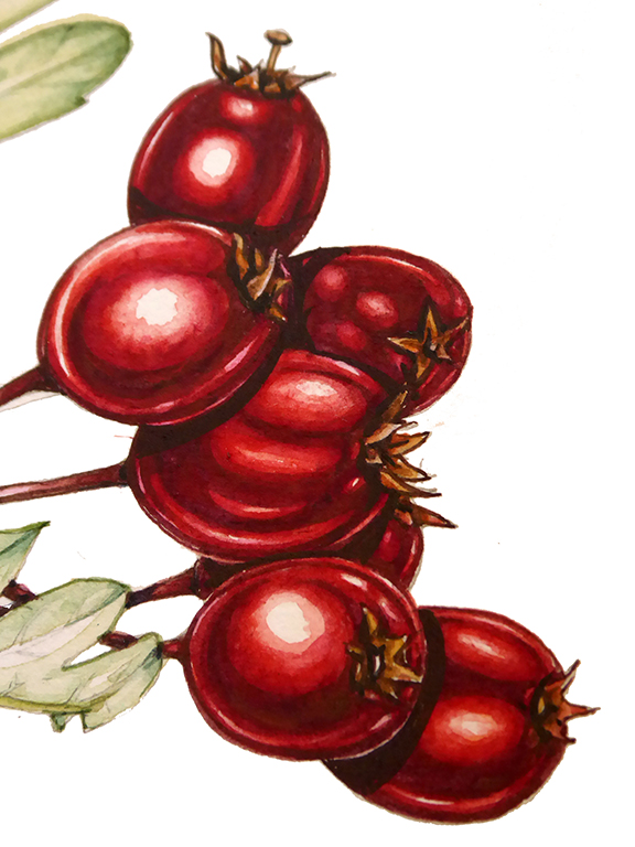
Finished berries!
One of the wonderful things about working up close and large is that once you’ve finished and get a little distance from your illustration it always looks so much better than it did in progress! You can see in this photo the very dark hue I mixed up for the shadows (in the paintbox middle pan) and the brightest of the orange reds I used (in the bottom pan).
If you’d like a condensed version of this as a printable image to work from, have a look at my Pinterest board where I’m trying to post some of these as one-page handouts for folks to work from (please only use these for your personal learning, thanks).
Amazing work very elegant creations.
Dear Andrew, thanks so much for your kind words, and for taking the time to leave a comment. Yours, Lizzie
This is so helpful. I’ve been struggling with how to get good contrast in my botanical painting and this is a really clear and useful demonstration. Thank you.
Hi Lynne
So pleased this helped, and thanks for the comment
yours
Lizzie