

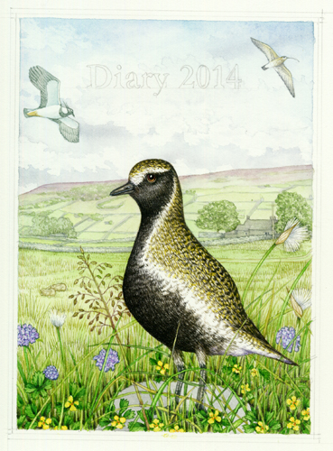
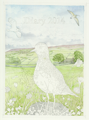
Illustrating a Golden Plover in Swaledale
Animals in their habitats
Many scientific illustrations and botanical and natural history illustrations I do are cut-to-white. However, I often illustrate subjects (like this plover) in their natural habitat. This can be a challenge, but also highly enjoyable. You can put in specific details (such as someone’s home, or a tree they really like). It also makes you think about the ecological niche you’re illustrating. What array of plants and animals are representative of that habitat?
Illustrating a Golden Plover
I recently did this illustration of a Golden Plover, as a diary cover for my father’s Christmas present (for more on illustrating Christmas present, click here). I knew I wanted the plover in a typical Yorkshire Dales landscape. I also wanted to include my parents’ home, Turnip House.
Gathering reference of the landscape and the plover
The first step is to collate your reference. I gathered photos of the plover and illustrations of moorland plants. I unearthed snap-shots of Turnip and the opposite valley. A few thumbnail sketches helped me decide on the composition. Once I knew what plants needed to be placed where, I drew up the rough.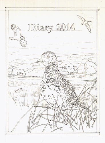
Materials and pencil rough
The main elements have been plotted in. The details of the plants and limestone at the plover’s feet need doing. I try to keep my pencil roughs atonal light. I use Pentel mechanical pencils (H or HB lead, 0.5mm), and a soft rubber. I’m using my favourite watercolour paper, Fabriano Artistico Hot Press. I also use a wonderful time-saving device, a light projector, which allows me to reduce and enlarge the different elements of the illustration.
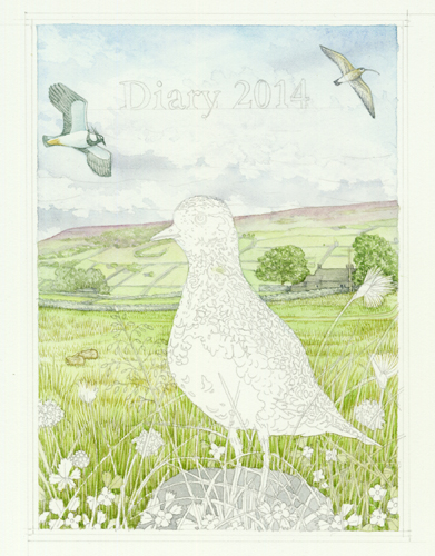
Here I’ve included plants we commonly see in Swaledale. These wild flowers grow in the grassland between common-grazing land and moorland; scabious, cotton grass, common quaking grass, and tormentil. I have to make a dreadful confession about the little yellow flowers of the tormentil. I lazily drew them from memory and have given them four instead of their rightful five petals. Luckily this commission is a gift, but it’s one of the biggest mistakes I’ve made in years. It’s and a stark reminder of why you should always consult your reference!
Illustrating the sky and background landscape
Next, after stretching the paper on a board with gummed tape (which stops the paper from buckling and thus allowing the paint to dry in pools instead of on the intended flat surface), I plotted in the sky. I’m the first to admit that I’m not a landscape painter, so doing backgrounds is difficult. My two rules of thumb are to keep colours light and definitions not too crisp. I try to be sure to merge colours a little. By this I mean bring the blue of the sky down onto the hillside, and the pale hill colour all the way to near the foreground. It seems to make the background less visually jarring.
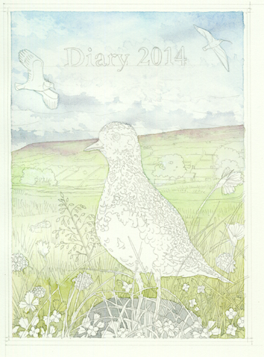
I use Winsor and Newton watercolour pans (which I top up with the same brand and colour of tube paints.) Recently I’ve discovered you’re not supposed to do this, but I’ve always been stubborn so shall continue. I use the best brushes ever, Winsor and Newton Series 7. For the background I used a number 2 size, for the details later on I prefer a number 1 and a double zero size.
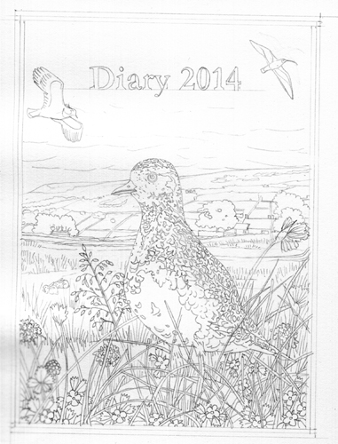
Working into details of the landscape
Next, I work into the detail of the landscape and grass. I keep it light and remember that the brightest colours and greatest contrasts need to be in the foreground. The biggest contrasts must be on the golden plover.
Turnip house looks like it does in life. The opposite hillside (which I grew up staring at) is more or less right. I checked this by asking my own children, who spend their holidays in Swaledale, if they knew where this illustration was of. Both got it right straight away. It’s reassuring, and I know they would have been more than happy to tell me if they thought it looked wrong.
Working into the foreground details
I work into the grass, trying to make the gradation between background and foreground smooth. The shadows in the foreground are darkened. The flying birds are plotted in (the curlew and pee-wit), as are and the distant rabbits.
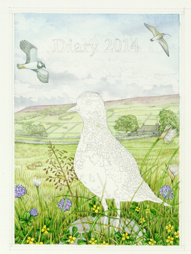
Illustrating the wild flowers at the plover’s feet
Here I’ve painted in the flowers and grasses around the plover. I’m keeping the starkest contrast for the nearest areas of foreground. I also try to stay aware of the colour balance in the painting as a whole. This explains why there’s quite a lot of purple in the darker areas of the plants; it echoes the heather on the opposite hillside. There’s plenty of yellow ochre in Turnip House, echoing the grassland.
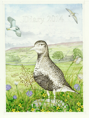
Illustrating the plover
Working into the plover (summer plumage) requires lots of tiny brush strokes. I use a mixture of purple and vandyke brown. I add yellow ochre to get the paler details next to the white area surrounding the chest. Mottled feathers are tricky to illustrate because we all know if they look wrong. Getting them to look right, as a massed area at a distance, requires some careful consideration. You need to think about the patterning of each feather, and the details and direction of the markings.
Having plotted in the areas of black, I suddenly wondered if the reference I was working from had the plover in only partial summer plumage. This turned out to be the case. I extended the area of black to link the chest to the head. Instead of just a suggestion of darker plumage near the eye, I used other reference to get the shape of the black feathers on the head correct.
Painting pale feathers and transitions
The gradation between the stark dark plumage and the white border requires lots of yellow ochre and some cereleun blue. This is fine, as it echoes the colours in the sky and scabious flowers. The distinctive golden speckling on the plumage was easy. I put cadmuim yellow light in very pale areas. I also added yellow ochre to some areas of detail. (I’d be lost without my yellow ochre, it’s far and away the most heavily used colour in my paint box).
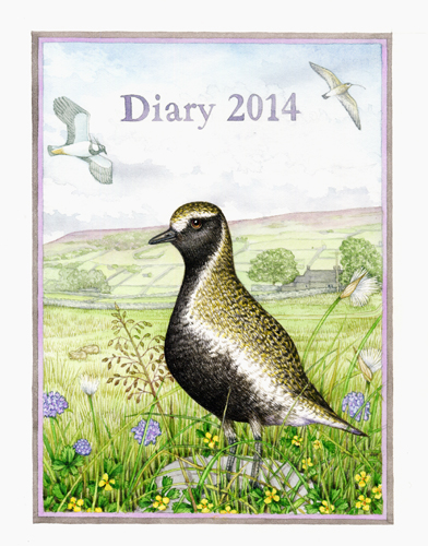
Finally, since the illustration is for a diary, I had to add text and a border. I chose the colours carefully, but always feel slightly sad to be putting text permanently onto a painting.
Here’s a youtube video of the process:
In conclusion
I like the final image, although there are several errors. The tormentil petals are wrong. There’s insufficient detailing of the plover wings. I cheating on the plover feet (hiding them in foliage is a well-used trick). Also, I think the grass is too yellow. However, it does remind me of my favourite place on earth, and of wandering about in the hills and dales; so something’s gone right.
Visit Yorkshire!
By the way, if anyone reading this is wondering about where to go on holiday, go to Swaledale (or Arkengarthdale). It’s more than beautiful; is riddled with history and culture (lead mining, anyone?); has the best walks on the planet; boasts a wonderful mix of moorland, pasture,and riverside; and this year (in July) has the Tour de France cycling through it! What’s not to love?